Less is more …..
Effective dashboards go beyond aesthetics as they combine 𝐔𝐗 – 𝐔𝐈 𝐝𝐞𝐬𝐢𝐠𝐧 with 𝐚𝐜𝐭𝐢𝐨𝐧𝐚𝐛𝐥𝐞 𝐢𝐧𝐬𝐢𝐠𝐡𝐭𝐬 to drive decisions.
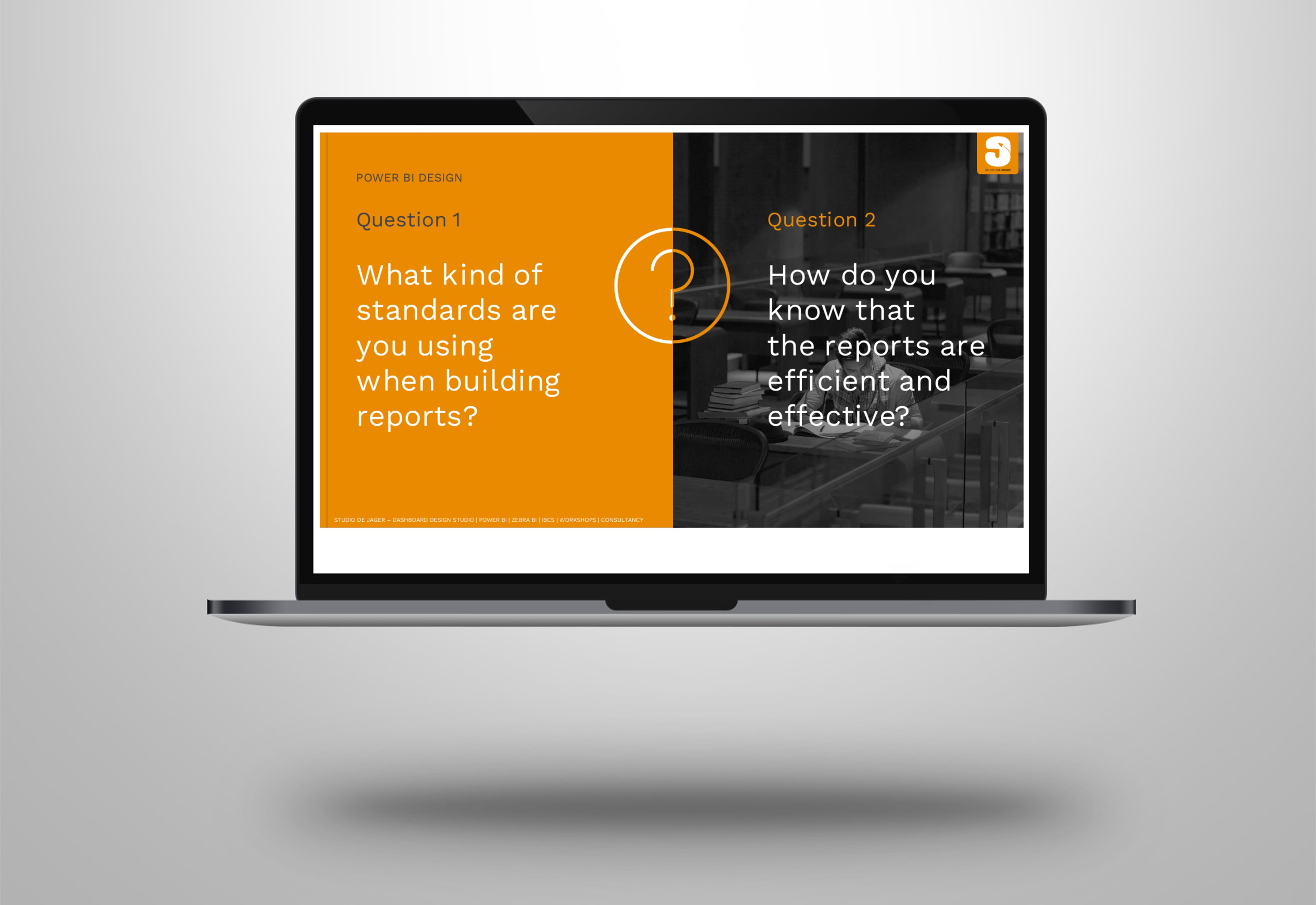
So how can you create such dashboards that it is still actionable? As a IBCS – International Business Communication Standards specialist I think that actionability should still be the most important part of a dashboard.
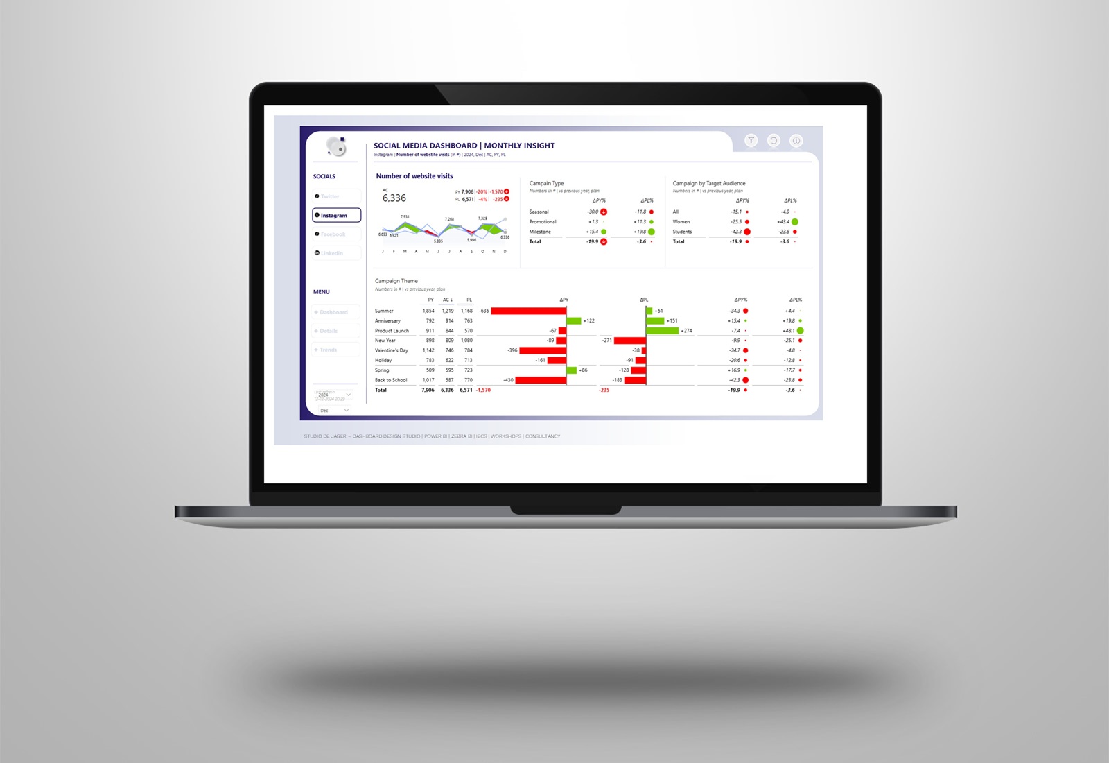
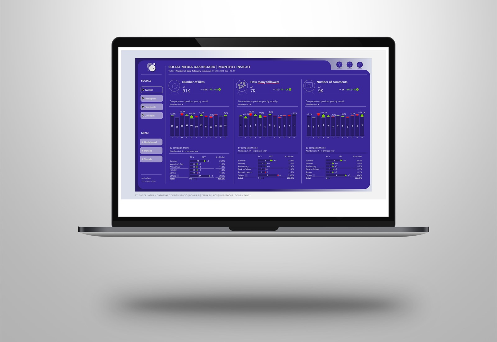
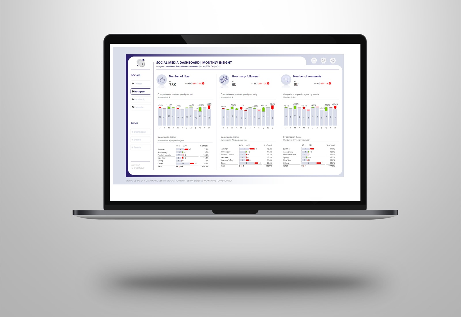
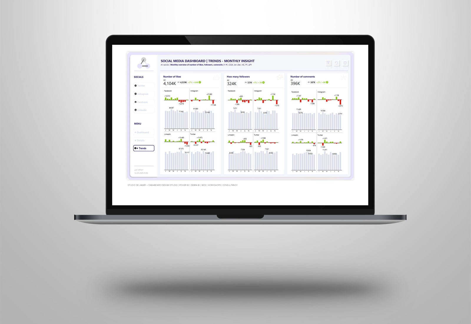
This is a new example of using KPI’s in a social media dashboard. The earlier version was also used by Injae Park in his classroom sessions. I’ll show you how to create a dashboard (with demo data of Zebra BI) putting it all together:
· 𝐂𝐥𝐞𝐚𝐧 𝐔𝐈/𝐔𝐗 𝐝𝐞𝐬𝐢𝐠𝐧: a clean design for a nicely looking dashboard
· Zebra BI: Using Zebra BI visuals (cards, charts) to create actionable insights without complex DAX measures
· IBCS – International Business Communication Standards: delivering consistency and clarity for quicker understanding.
· 𝐀𝐜𝐭𝐢𝐨𝐧𝐚𝐛𝐥𝐞 & 𝐮𝐧𝐝𝐞𝐫𝐬𝐭𝐚𝐧𝐝𝐚𝐛𝐥𝐞: A dashboard is only effective if it helps users take the right actions.
Sometimes is it not necessary to show too much information in your dashboard. Less is more !
Used elements in this KPI dashboard are:
· Zebra BI cards
· Zebra BI Small multiple charts with absolute variances
· Data labels density to Min – Max
· Axis label density to every 2-th label
Built with |Zebra BI visuals, so every chart, table and card is IBCS-compliant. Meaning your reports will be clear, consistent, and instantly understood by anyone in your organization.
If you want to know more about actionable reporting, please contact me.
studiodejager.nl | dashboard design studio
Report & dashboard design | Official Zebra BI Partner | Power BI | IBCS Certified | Data visualization | Interim business consultancy