Introducing the power duo: IBCS and Zebra BI. By adopting these industry standards and cutting-edge tools, your company can achieve consistency and clarity in its reports. IBCS (International Business Communication Standards) provides a framework for standardized reporting, ensuring that your reports are clear, concise, and easily understandable across departments and stakeholders. Complementing IBCS, >> Lees verder
Power BI | Actionable reporting – part 9 – actionable visuals
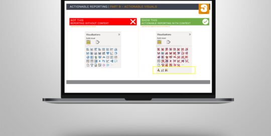
Sasja Jager, de2025-11-14T13:12:02+01:00Last year I started making a number of posts to share some tips and tricks about making actionable reports. Given the positive feedback I've received, I've decided to continue this series with actionable visuals. In Power BI there a more than 40 visuals as a default available to use in your report page. >> Lees verder
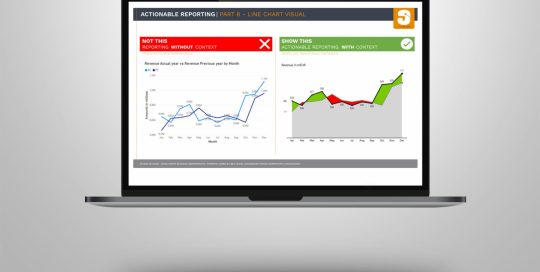
Power BI | Actionable reporting – part 8 – line chart visual
Sasja Jager, de2025-11-14T13:04:52+01:00Do you use line chart visuals in your report? How effective are they on a dashboard? Are they easy to read and to understand for the viewer? In today's reality, creating reports that are just showing some numbers is not enough. Actionable Reporting is about getting insights fast: the faster you learn what’s >> Lees verder
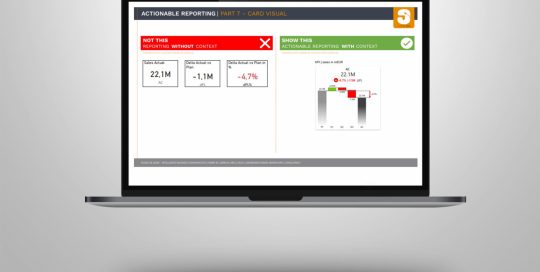
Power BI | Actionable reporting – part 7 – KPI card visual
Sasja Jager, de2025-11-14T13:08:05+01:00Do you use KPI card visuals in your report? Cards visuals should probably be the best way to show an overview of the most important KPIs. How effective are they on a dashboard? Are they easy to read and to understand for the viewer? In today's reality, creating reports that are just showing >> Lees verder
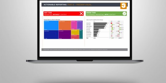
Power BI | Actionable reporting – part 6 – treemap visuals
Sasja Jager, de2025-11-14T13:08:35+01:00Do you use treemap visuals in your report? How effective are they on a dashboard? Are they easy to read and to understand for the viewer? In today's reality, creating reports that are just showing some numbers is not enough. Actionable Reporting is about getting insights fast: the faster you learn what’s happening >> Lees verder
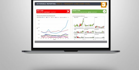
Power BI | Actionable reporting – part 5 – “spaghetti” (line) chart visuals
Sasja Jager, de2025-11-14T13:05:43+01:00Do you use “spaghetti” charts in your report? How effective are they on a dashboard? Are they easy to read and to understand for the viewer? In today's reality, creating reports that are just showing some numbers is not enough. Actionable Reporting is about getting insights fast: the faster you learn what’s happening >> Lees verder
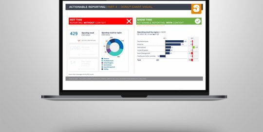
Power BI | Actionable reporting – part 4 – donut visual by Aegon
Sasja Jager, de2025-11-14T13:13:30+01:00Do you use donut visuals in your report? How effective are they on a dashboard? Are they easy to read and to understand for the viewer? In today's reality, creating reports that are just showing some numbers is not enough. Actionable reporting is about getting insights fast: the faster you learn what’s happening >> Lees verder
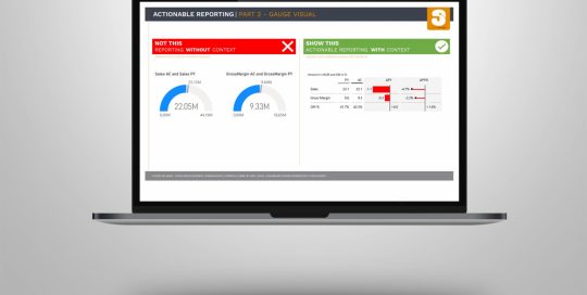
Power BI | Actionable reporting – part 3 – gauge visual
Sasja Jager, de2025-11-14T13:06:25+01:00Do you use gauge visuals in your report? How effective are they on a dashboard? Are they easy to read and to understand for the viewer? In today's reality, creating reports that are just showing some numbers is not enough. Actionable Reporting is about getting insights fast: the faster you learn what’s happening >> Lees verder
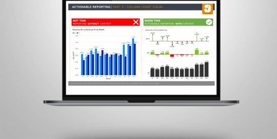
Power BI | Actionable reporting – part 2 – chart visual
Sasja Jager, de2025-11-14T13:06:45+01:00In today's reality, creating reports that are just showing some numbers is not enough. Actionable Reporting is about getting insights fast: the faster you learn what’s happening with your performance, the faster you can decide what to do next. When looking at a report visual, you should be able to tell right away >> Lees verder
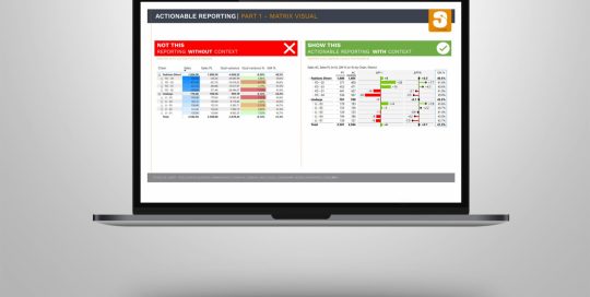
Power BI | Actionable reporting – part 1 – matrix visual
Sasja Jager, de2025-11-14T13:07:01+01:00In today's reality, creating reports that are just showing some numbers is not enough. Actionable Reporting is about getting insights fast: the faster you learn what’s happening with your performance, the faster you can decide what to do next. When looking at a report visual, you should be able to tell right away >> Lees verder