Power BI | Actionable reporting - part 5 – “spaghetti” (line) chart visuals
Do you use “spaghetti” charts in your report? How effective are they on a dashboard? Are they easy to read and to understand for the viewer?
In today’s reality, creating reports that are just showing some numbers is not enough. Actionable Reporting is about getting insights fast: the faster you learn what’s happening with your performance, the faster you can decide what to do next.
When looking at a report visual, you should be able to tell right away if your performance:
- is it good or bad
- how good or how bad
- why is it good (or bad)
How much time does it cost you to answer any of those questions by looking at a traditional report visual?
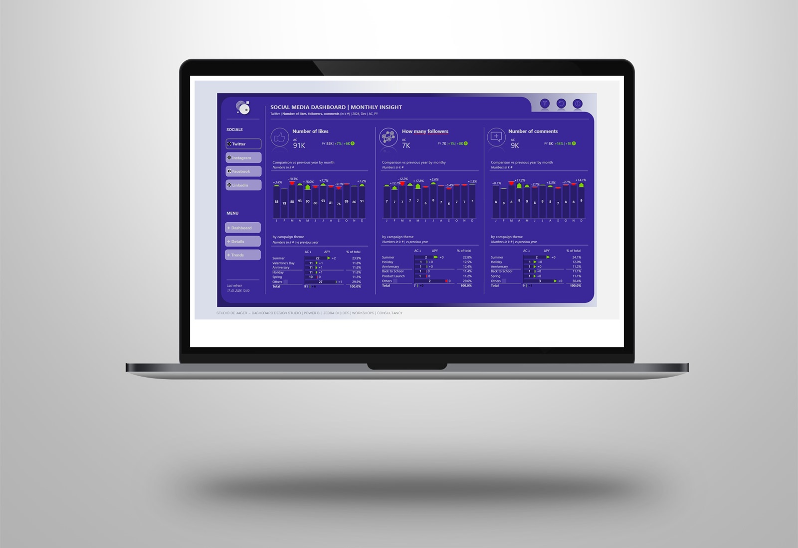
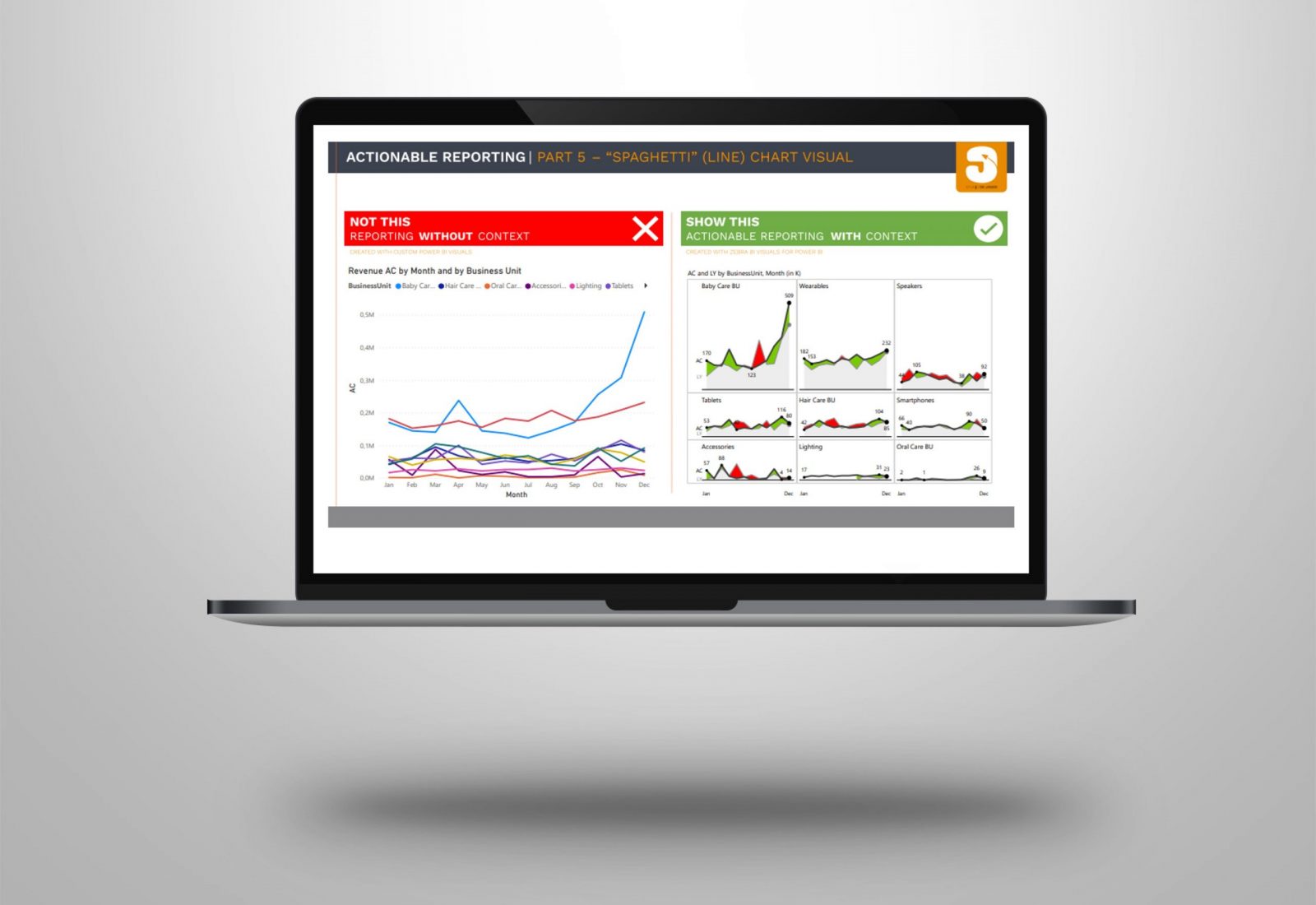
A frequently used visual in Power BI is the line chart visual. But sometimes it is used to show too much categories in the chart, so the chart is transformed into a “spaghetti” chart.
Look at the left visual. Is this actionable & understandable for the reader…….?
There is a better way to make reports interesting, meaningful, understandable and actionable with the use of a different visual.
Why is the spaghetti visual not actionable?
- While colorful, it doesn’t really tell us all that much, there is no context.
- The data labels are not connected to the legends, it’s not easy to see which colors belong to the business units.
- They don’t display variances, no comparison with last year so not much context.
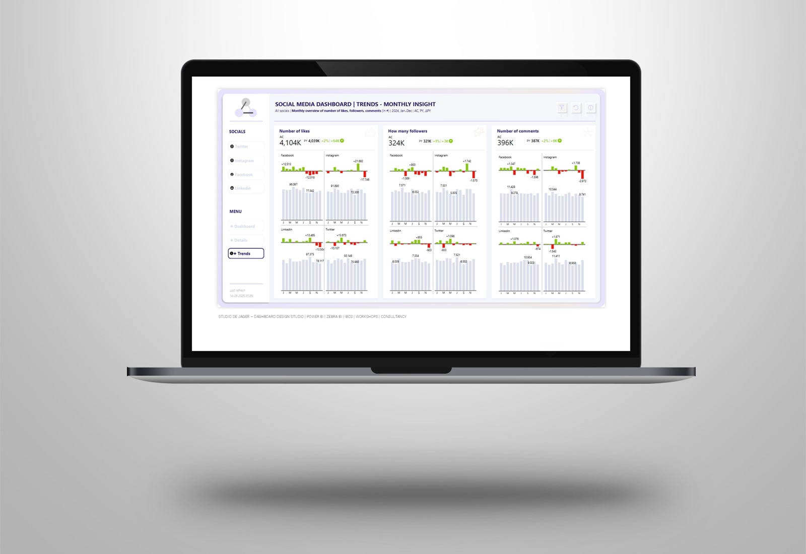
Here is an example how this might look like in your report, a before vs after, with the use of a Zebra BI visual.
- IBCS recommends that we break it all down into separate charts. This is something that is called small multiples.
- Small multiples are one of the most powerful data visualization methods.
- We need something more to create context and because we also have some space left, we even can make the comparisons with last year.
- Changed the information density for the data labels to only show the first, last, min and max
- Reduced the X-as labels to only show the first and last period.
Why using Zebra BI?
- Easy to use without having to create extra measures
- Build reports 10x faster, get immediate visualization of your data
- Automatic applying of IBCS standards
- Increase in speed of analysis by +46%
- Improvement in decision accuracy by +61%
Need help with transforming your data into actionable reports? As an official Zebra BI partner we can help you with this.
studiodejager.nl | report & dashboard design studio
Official Zebra BI Partner | Power BI – Excel | IBCS Certified Analyst | Data visualization | Interim business consultancy | dashboard design
Let’s create better reports & dashboards !
#zebrabi #visualization #report #dashboard #UX UI design #design #PowerBI #PowerBICommunity #Data #BusinessIntelligence #BI #IBCS