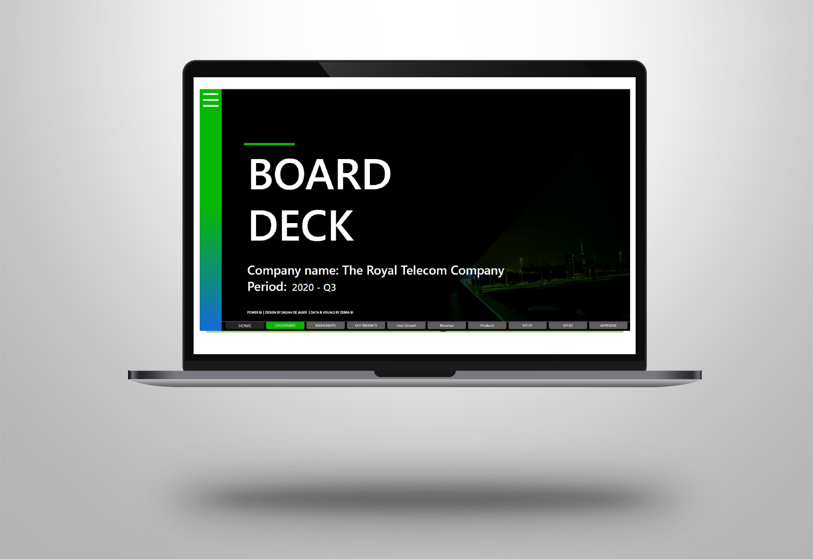
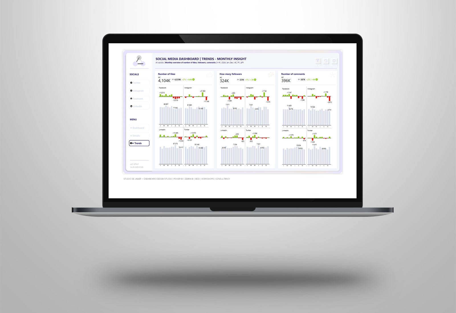
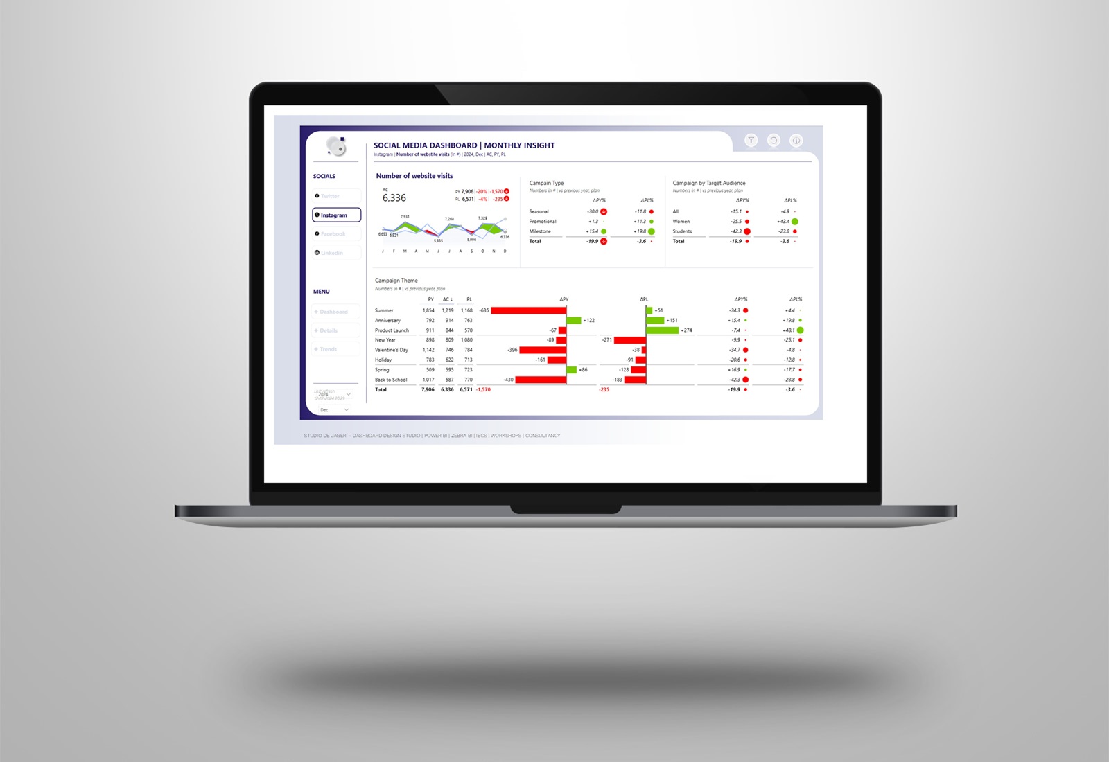
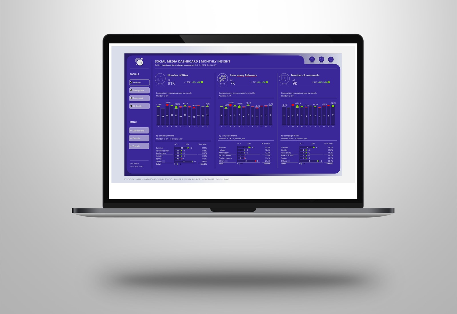
Power BI | Board Deck presentation with a KPN taste
Many companies are still using PowerPoint for presenting their quarterly figures. For the people behind this presentation, it cost a lot of manual work to create it, a lot of copy and pasting.
So why not use Microsoft Power BI for these presentations? Last time I’ve made a T-Mobile deck presentation, but I received a request from another “Power BI and Zebra BI enthusiastic“, Wilco Nagtzaam, to create a KPN version, the “Royal Telecom Company”. In the dashboard I use fake data & text, use Zebra BI visuals and gave it all a KPN design.
Components for this board deck are:
Designing of the background slides | Zebra BI visuals (charts & tables & KPI’s) | animated menu buttons (svg) | navigation buttons | a lot of creativity
All the text in the board deck is based on dynamic comments, change the periodic slicer and the comments are changed.
Comments are chronically missing from Power BI dashboards and reports. However, if you manage to include dynamic commentary, your reports will become strikingly more understandable and actionable. It’s free and easy to do.
How to create dynamic comments?
There are different methods to do, but I have used a very simple matrix table in Power BI.
- Create a simple table in Excel with the comments
- Import comments table into Power BI
- Create a few DAX formulas
- Use a native matrix visual in Power BI
- Design the matrix
- And you’re ready.
On the Zebra BI website you can find a very detailed instruction on how to create it.
Hope you like it !
If you also want to have such a Power BI dashboard for your company, pls feel free to connect.
