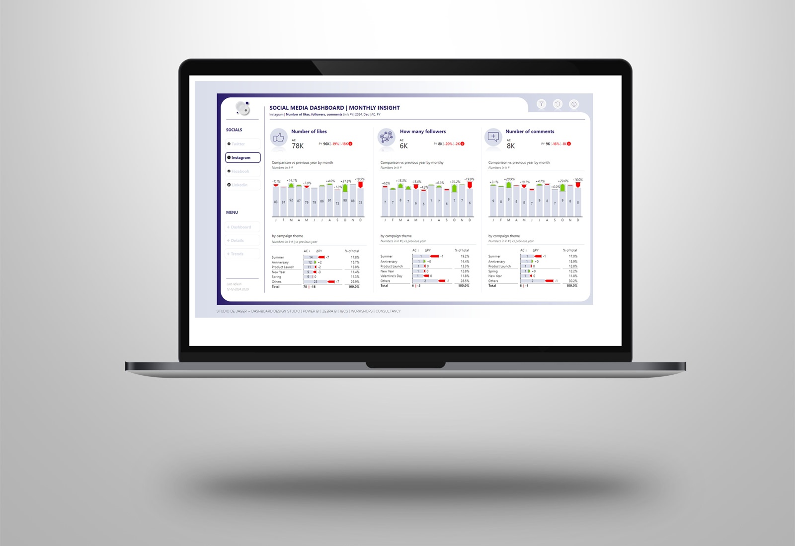
Power BI | filters on a dashboard with starbucks
When designing a Power BI dashboard / report the use and placing of the filters can be a bit of a dilemma. Place the filters to the left, right, hide the filters …..
I read a post of Natalia Kiseleva in which she explained it in a very nice way, with some nice sketches.
So how does that look on a real Power BI dashboard?
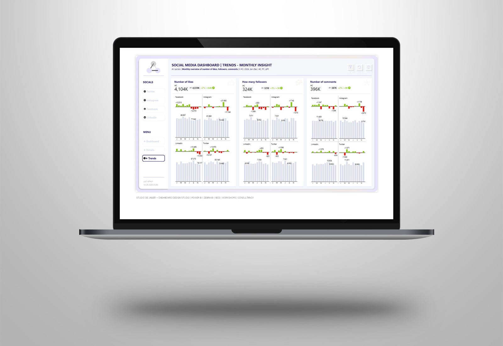
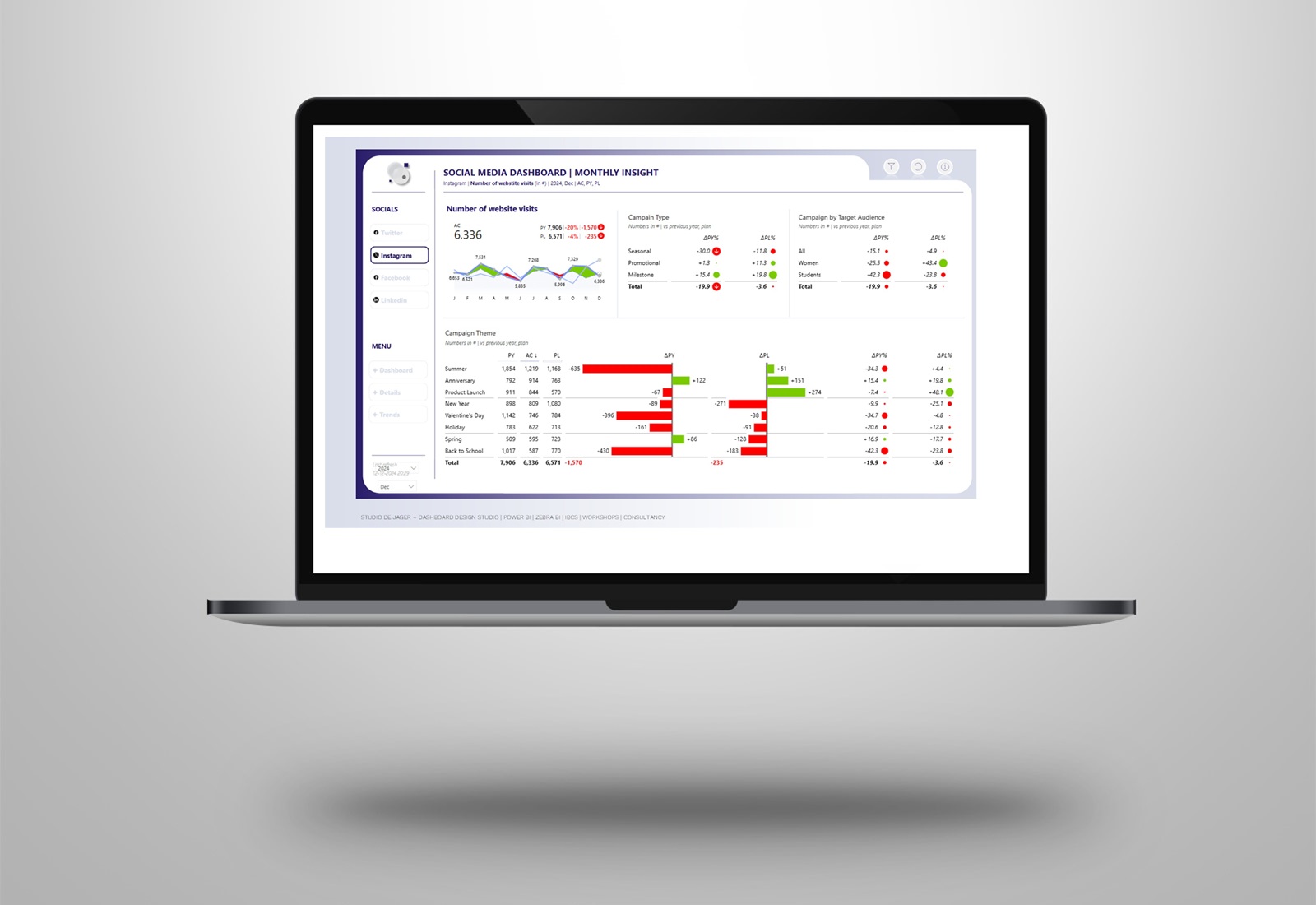
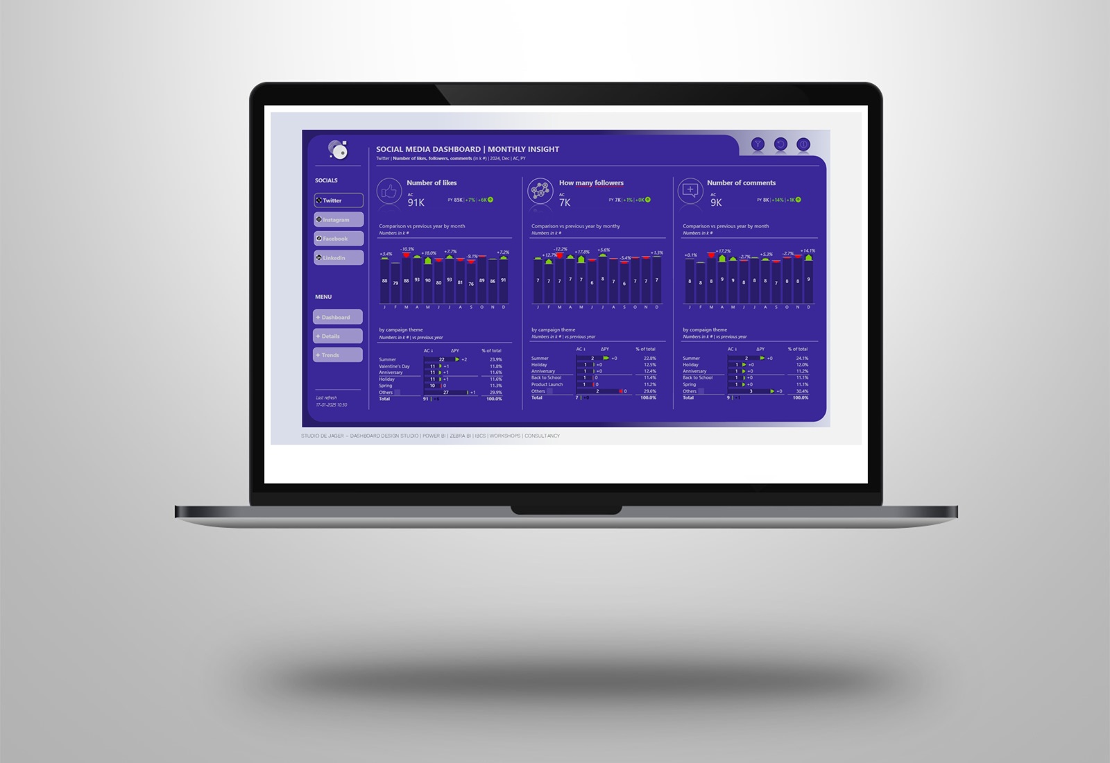
I decided to create a Power BI dashboard with those examples to have a look at it. In the dashboard I used fake data & text, used the Zebra BI visuals and gave it all a Starbucks design.
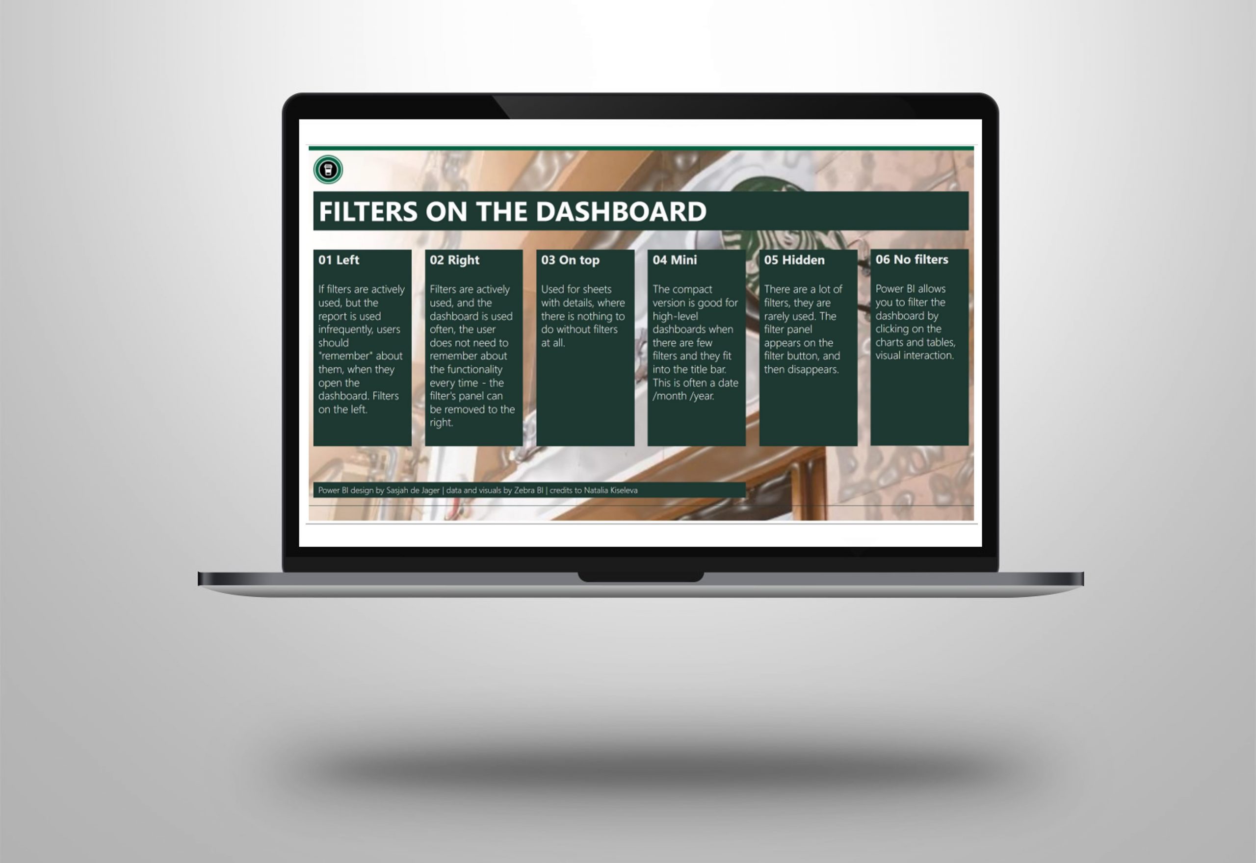
A few options for the filters are:
1 | To the left
2 | To the right
3 | On top
4 | Mini filters
5 | Hidden filters
6 | No filters at all (interaction of the visuals)
Attached screenshots of the dashboard.
How do you use filters and where do you place the filters on the dashboard?
Big credits to Natalia Kiseleva for the original post !
Hope you like it !
Sasjah de Jager
Report & dashboard design | Official Zebra BI Partner | Power BI – Excel | IBCS Certified Analyst | Data visualization | Interim business consultancy
Let’s create better reports & dashboards !
#zebrabi #visualization #powerbi #report #dashboard #UX UI design #ibcs #design #filters #slicers
