Power BI | dashboard with a Douwe Egberts taste
Many people are working at home during the corona period. One of the advantages of this is that we can choose our own favorite coffee. I like to drink coffee of Douwe Egberts.
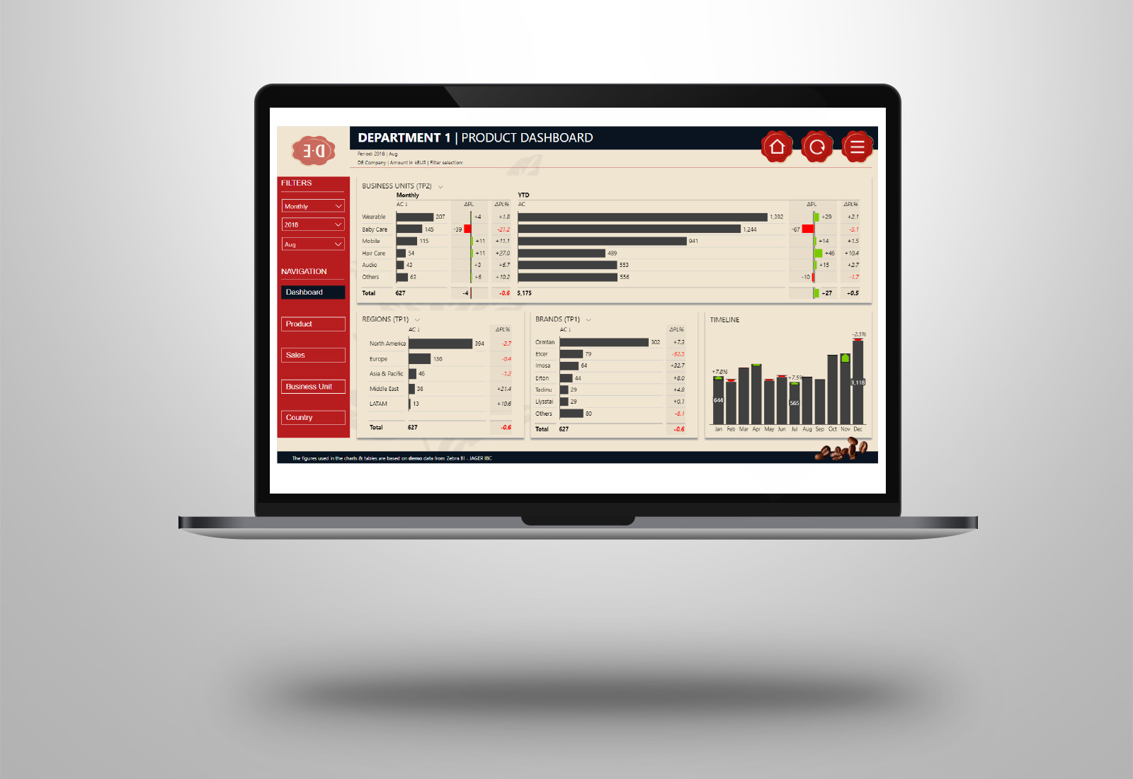
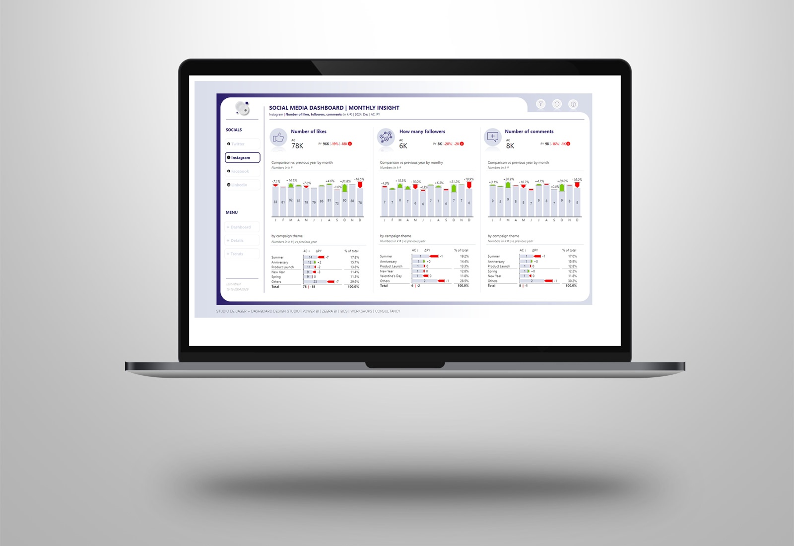
I thought it would be fun to make a Douwe Egberts Power BI sales dashboard. Coffee & Microsoft Power BI, a great combination! In the dashboard I used fake data, used the Zebra BI visuals and gave it all a Douwe Egberts design.
The report includes the following elements:
- Intro / page navigation: choice in page navigation instead of ending up directly on a landing page at startup.
- Logo with animation effect
- Custom tooltips: increasing possibilities compared to standard tooltips, more space, more variation in visuals
- Breadcrumbs: to increase the visibility of the used slicer/filter selections
- Zebra BI visuals (charts & tables): for actionable and understandable reporting according to the IBCS standards.
Thank you Douwe Egberts for making great coffee!
Info: de.nl
