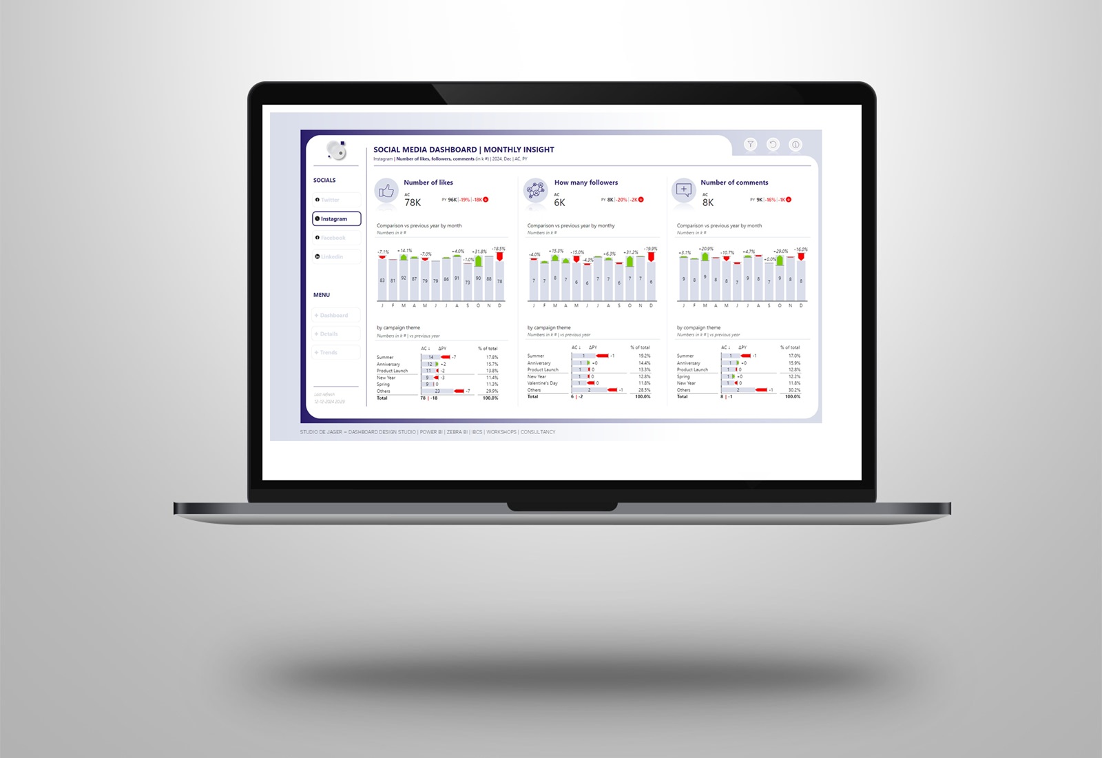
Power BI | dashboard with a Milka taste
Characteristic of Milka is not only the delicious taste of their chocolate but of course also the purple cow, who doesn’t know it.
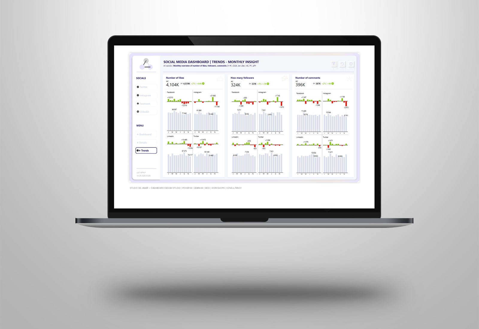
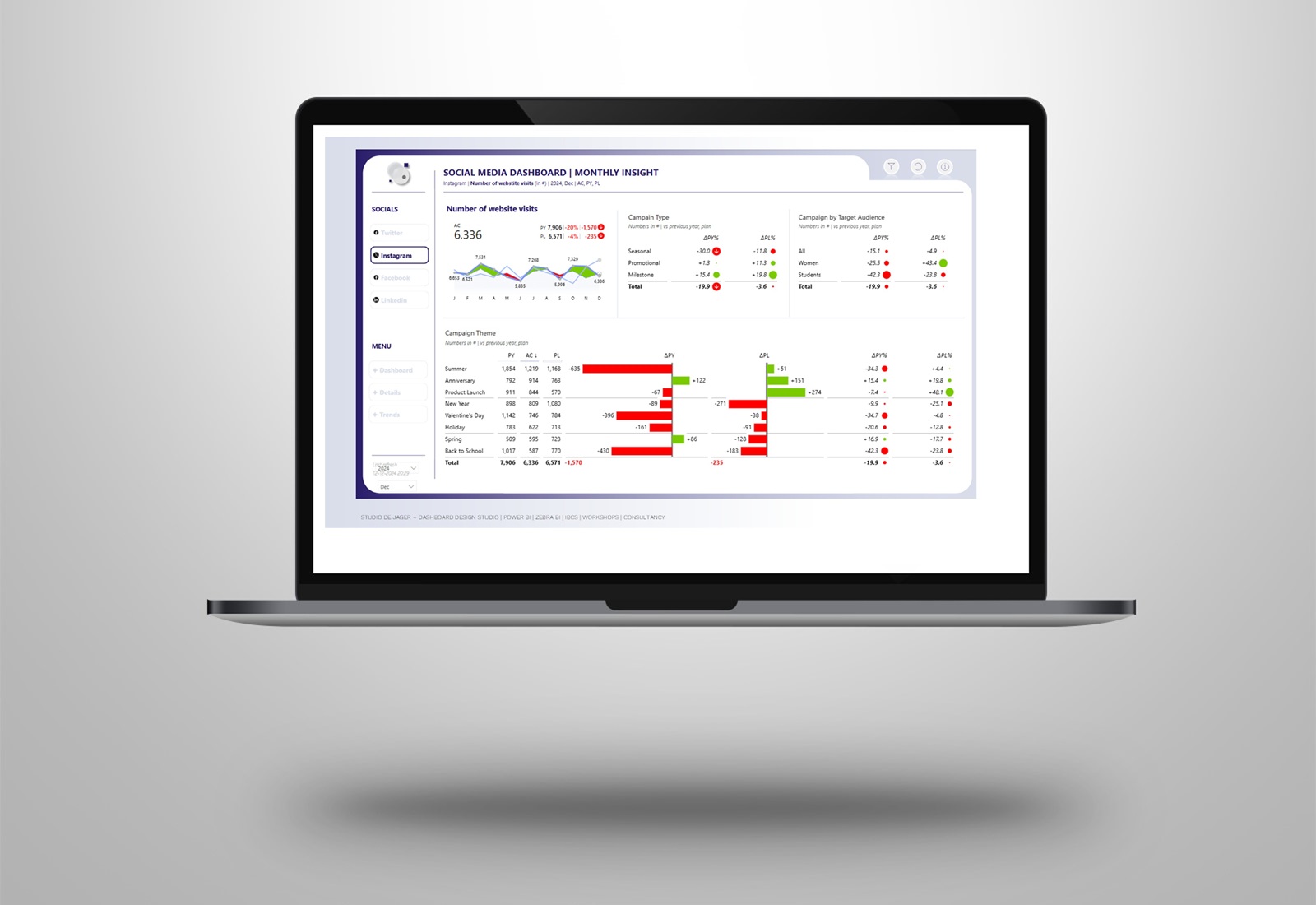
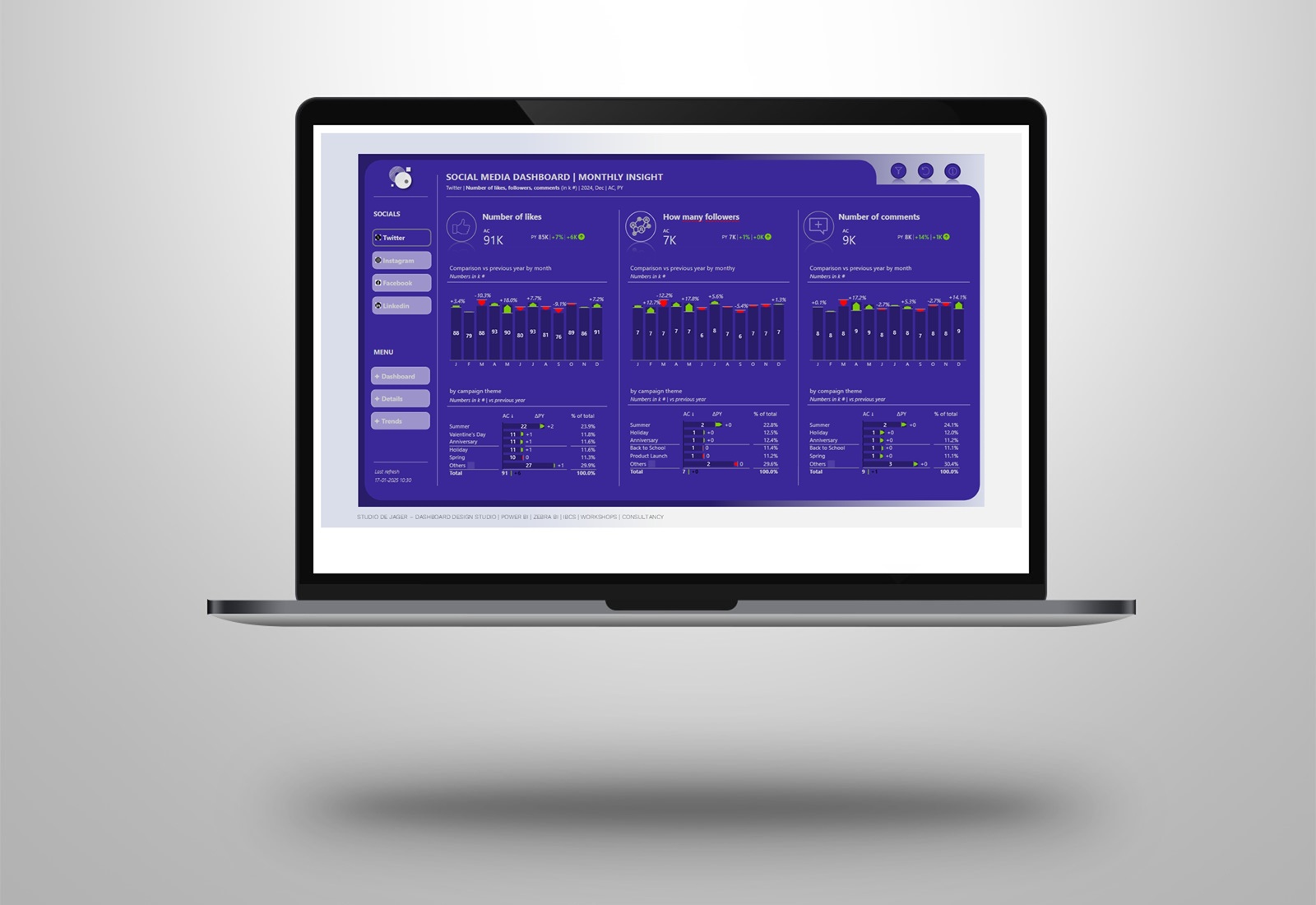
I thought it would be fun to make a Milka dashboard because of the beautiful colors of this brand and ….. naturally …… the cow…… In the dashboard I used fake data, used the Zebra BI visuals and gave it all a Milka design.
In this dashboard I want to show some more possibilities about increasing (or adding) ” the user experience feeling” to Power BI dashboards.
The report includes the following elements:
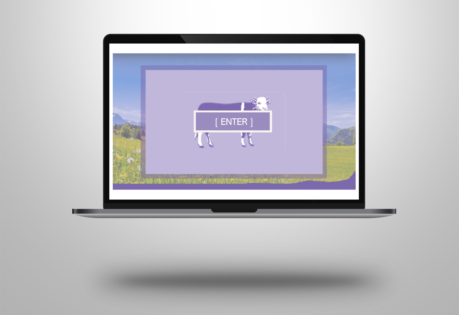
- Dashboard intro + page navigation: choice in page navigation instead of ending up directly on a landing page at startup.
- Custom tooltips: increasing possibilities compared to standard tooltips, more space, more variation in visuals
- Breadcrumbs: to increase the visibility of the slicer/filter selections
- Zebra BI visuals (charts & tables): for actionable and understandable reporting according to the IBCS standards. Check out the zoom function at the small multiples and the flexibility in creating the tables and graphs.
