Power BI | UI design a la Desperados beer
I already published the UI designed Power BI reports of Birra Moretti and Corona beer. The last of this “beer episode” should be Desperados. This is because I really like the design, every flavor has its own design identity.
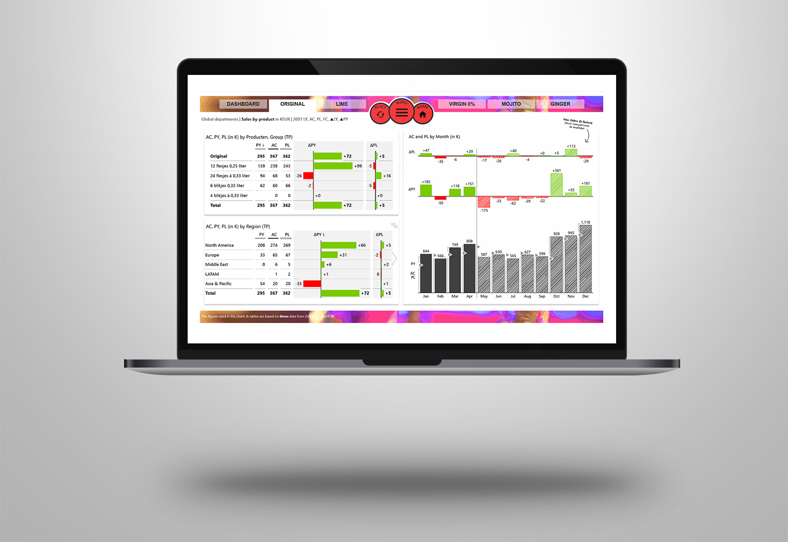
I thought it would be super fun to build a Microsoft Power BI dashboard based on Desperados beer. Every page has its own design based on the colors of the flavor. A business report in Power BI with the look and feel of a website, UI design a la Desperados.
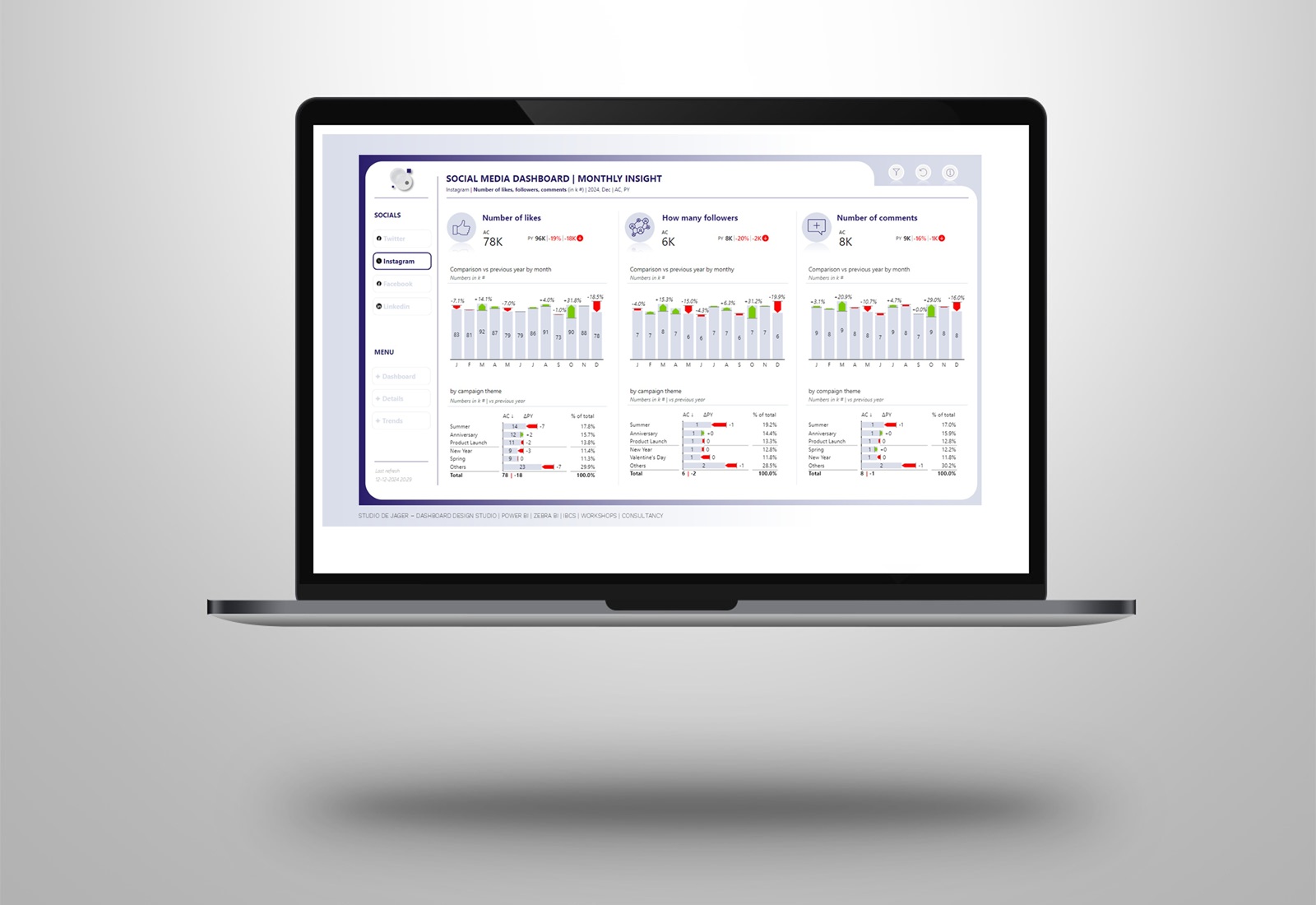
The dashboard is made with demo data and of course contains the visuals of Zebra BI, made with the 4.6 update. You can see different type of visuals, all these visuals are responsive. In this example you can see how you can add forecasting (FC) figures to your report, according to the IBCS standards always “hatched”. Further in this report: bookmarks, buttons, drill through, page navigation, extended filter menu etc.. Check the special animated “home page”.
Video Power BI report:
Which flavor do you like?
Salute !
