My passion is to create exciting visualizations, reports and dashboards. To use the right charts, tables and visuals and also to add some customer designing (corporate identity formatting).
The last couple of months I have done some research about “story telling with data”, data visualization, business reporting, infographics etc.. I have found a lot of inspiration from very different sources, to name a few: MakeOverMonday, StoryTelling With Data, IBCS®, Zebra BI , Raconteur, CleverFranke, visualcapitalist.com, visualcinnamon.com, EnterpriseDNA.
My personal goal for this year is to create a weekly visualization in Excel or Power BI, learn from others and work with others and to improve my skills.
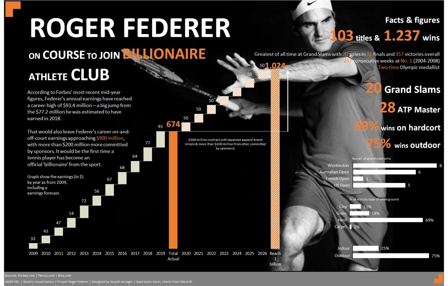
This week’s visualization is about a the earnings of Roger Federer. Last month in the Dutch newspaper AD.nl (source tennis.com, forbes.com) an article was published of the Roger Federer who is on course to join the billionaires athlete club.
For me this seems to be a nice opportunity to create a visualization of his earnings in time. To show the actuals and forecasted earnings by using a waterfall graph from Zebra BI.
