Power BI | RAI data - dashboard makeover
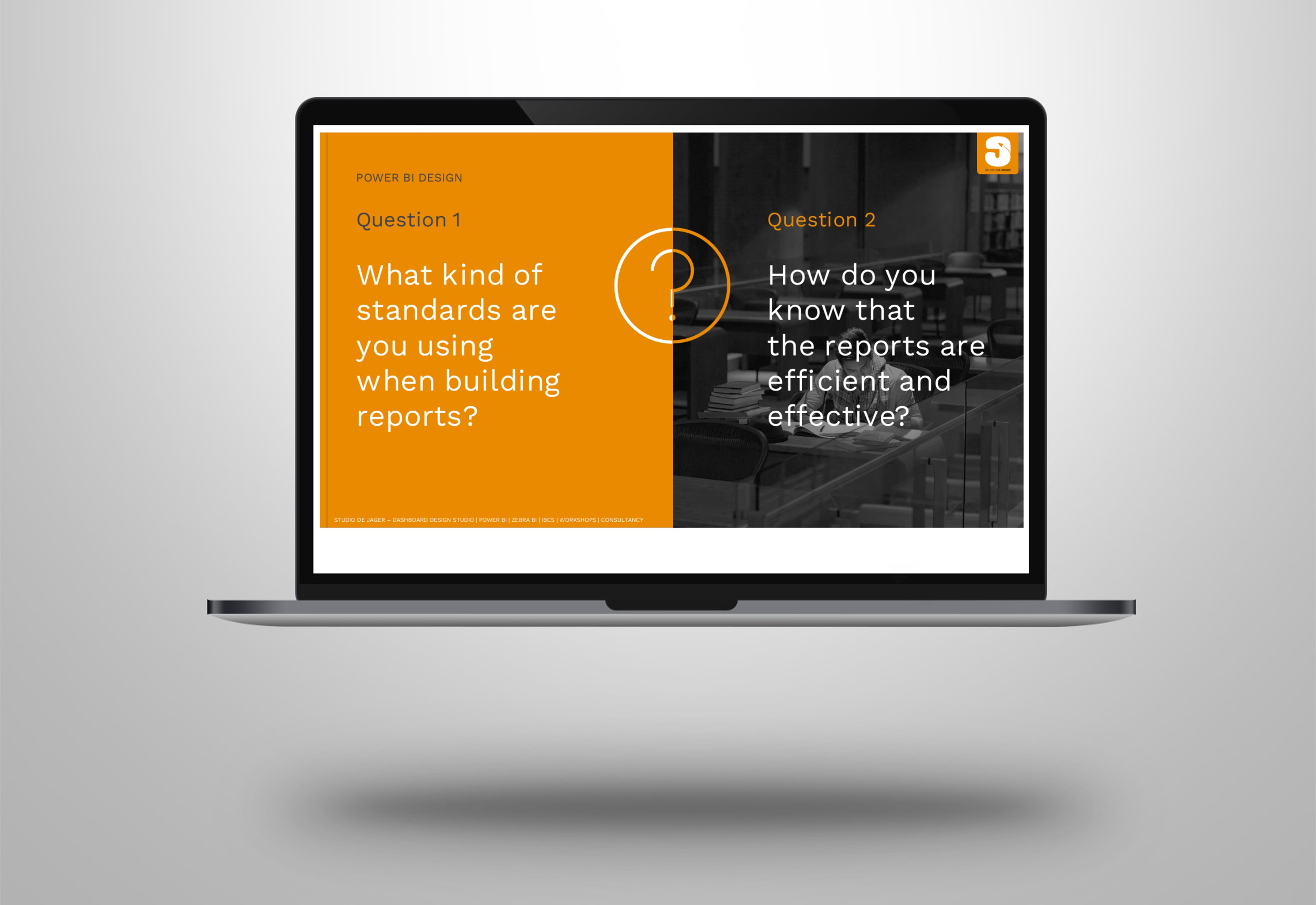
I’m passionate about my work as a front-end Power BI consultant. I love to combine 𝘥𝘦𝘴𝘪𝘨𝘯 with 𝘢𝘤𝘵𝘪𝘰𝘯-𝘰𝘳𝘪𝘦𝘯𝘵𝘦𝘥 visuals from Zebra BI in Power BI and I’m a big fan of the IBCS – International Business Communication Standards.
Recently I came across an online dashboard from the RAI Vereniging and I thought …… there must be another way to visualize this …. how would it look like if we combined 𝐝𝐞𝐬𝐢𝐠𝐧 with 𝐈𝐁𝐂𝐒 & 𝐙𝐞𝐛𝐫𝐚 𝐁𝐈?
So, time for a makeover and show you this example.
𝐑𝐀𝐈 𝐫𝐞𝐩𝐨𝐫𝐭
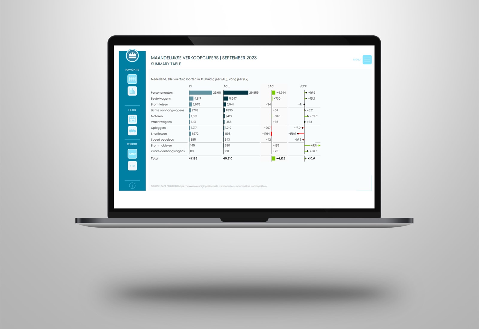
The current reports allows the (public) viewer to have a look at the number of sold vehicles, by type. In the comments the link to the original report.
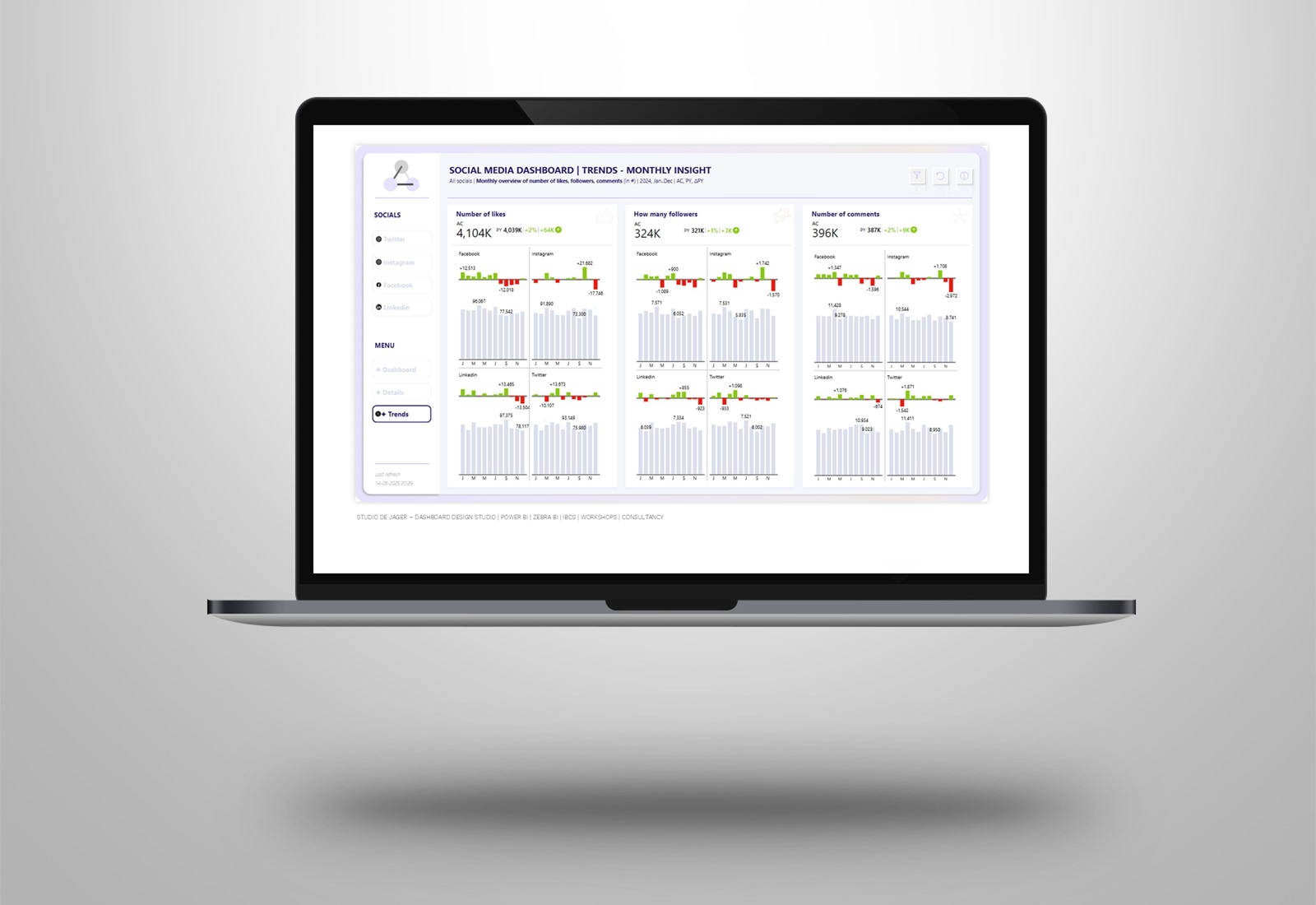
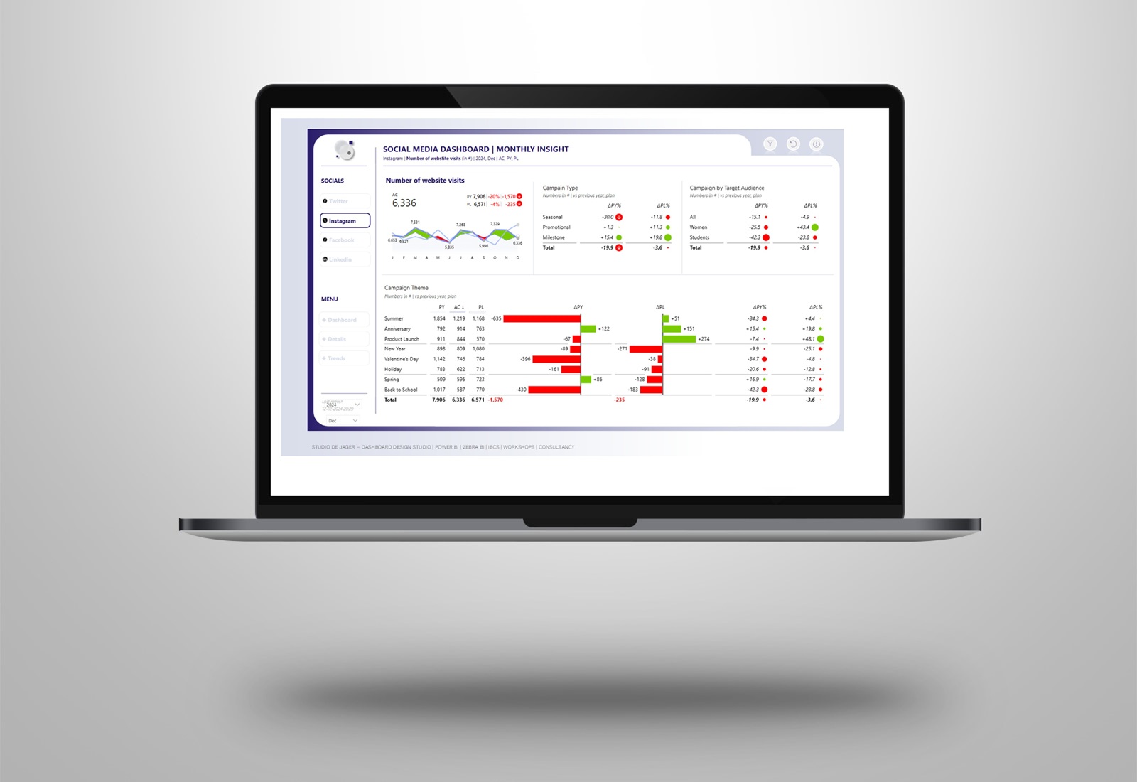
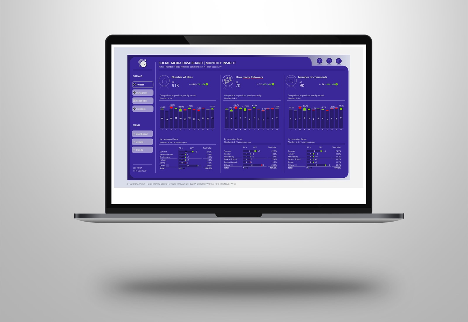
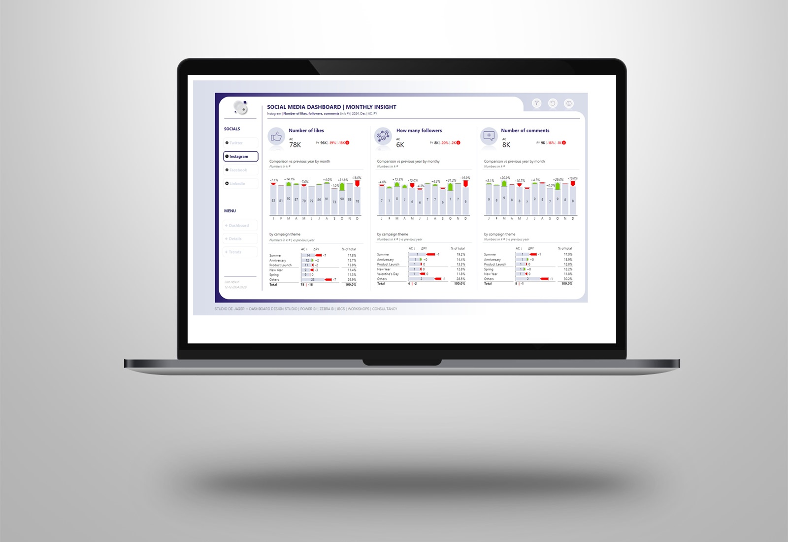
𝐌𝐚𝐤𝐞𝐨𝐯𝐞𝐫
I redesigned the current RAI vereniging report, decided to go for a nice and clean design of the report based on the RAI corporate identity. Used the Zebra BI table + chart visuals and gave it all a RAI vereniging design.
Zebra BI visuals are fully responsive and calculate automatically variances (relative and absolute), so no need to create extra DAX measures. Saves you a lot of time 😊
𝘈𝘣𝘰𝘶𝘵 𝘙𝘈𝘐 𝘢𝘴𝘴𝘰𝘤𝘪𝘢𝘵𝘪𝘰𝘯
RAI stands for Bicycle and Automotive Industry. The association was founded on December 17, 1893. RAI represents the interests of more than 700 manufacturers and importers of various types of vehicles.
Attached screenshots of the dashboard.
Hope you like it !
Sasjah de Jager
Report & dashboard design | Official Zebra BI Partner | Power BI – Excel | IBCS Certified Analyst | Data visualization | Interim business consultancy
Let’s create better reports & dashboards !