Power BI dashboard design | When design meets actionability
The motto “𝙈𝙖𝙠𝙚 𝙮𝙤𝙪𝙧 𝙋𝙤𝙬𝙚𝙧 𝘽𝙄 𝙧𝙚𝙥𝙤𝙧𝙩𝙨 𝙣𝙤𝙩 𝙡𝙤𝙤𝙠 𝙡𝙞𝙠𝙚 𝙋𝙤𝙬𝙚𝙧 𝘽𝙄!” as Nicholas Lea-Trengrouse stated is something I really like. Follow Nicholas because he creates amazing dashboard examples.
Effective dashboards go beyond aesthetics as they combine UX/UI design with actionable insights to drive decisions.
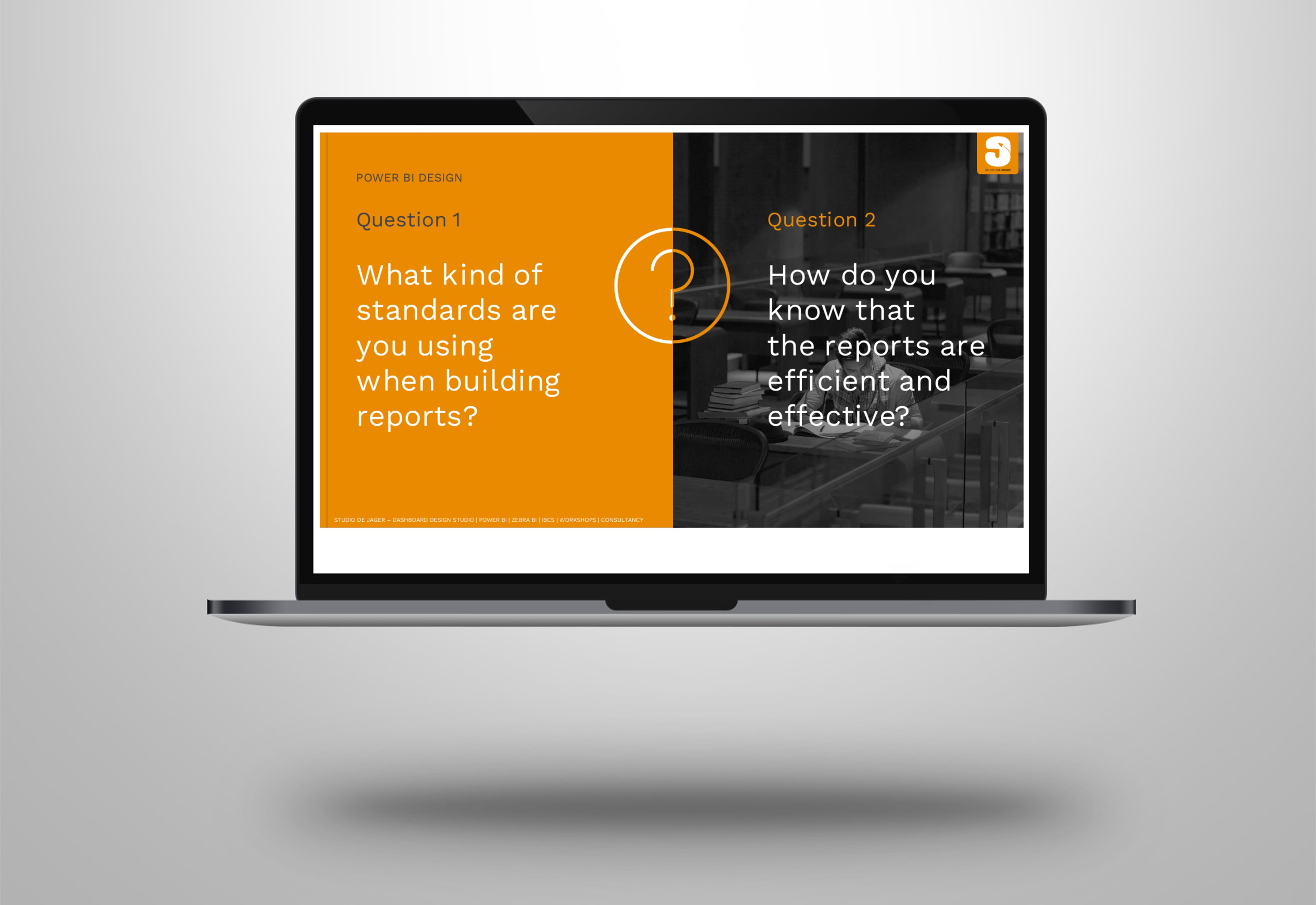
So how can you create such dashboards that it is still actionable?
As a IBCS – International Business Communication Standards and Zebra BI specialist I think that this should be the most important part of a dashboard.
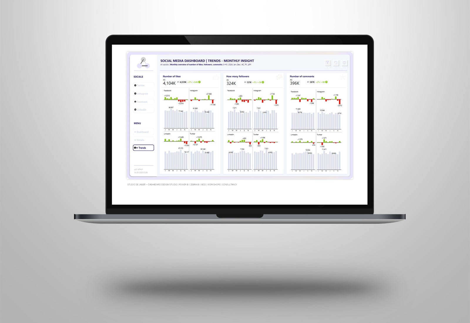
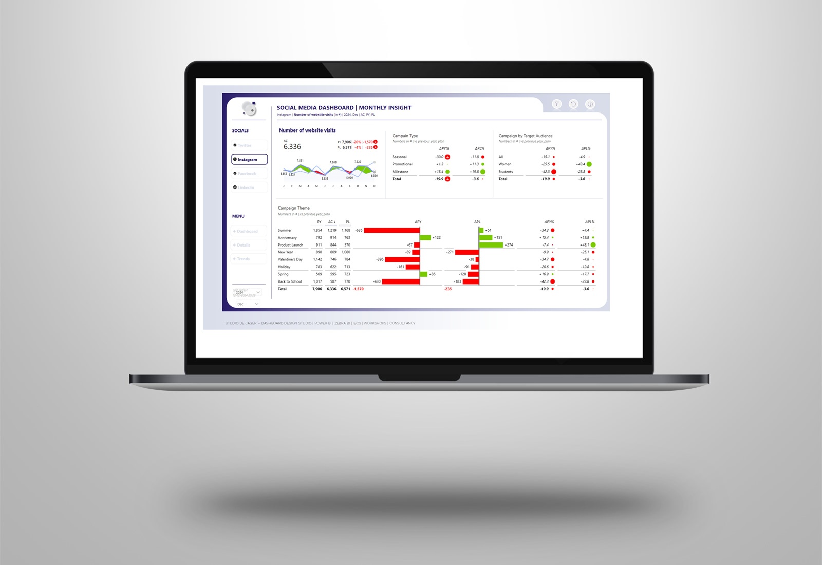
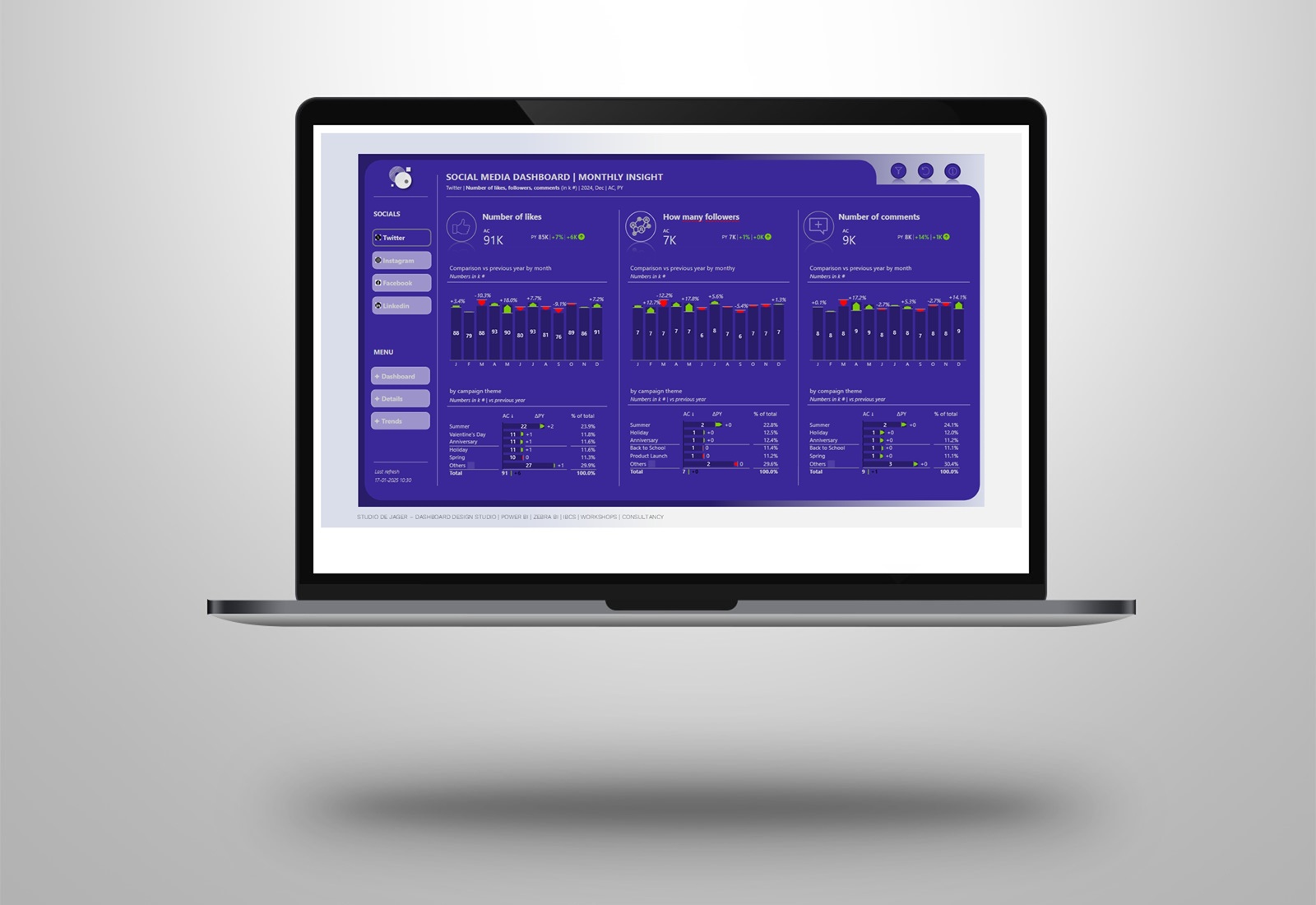
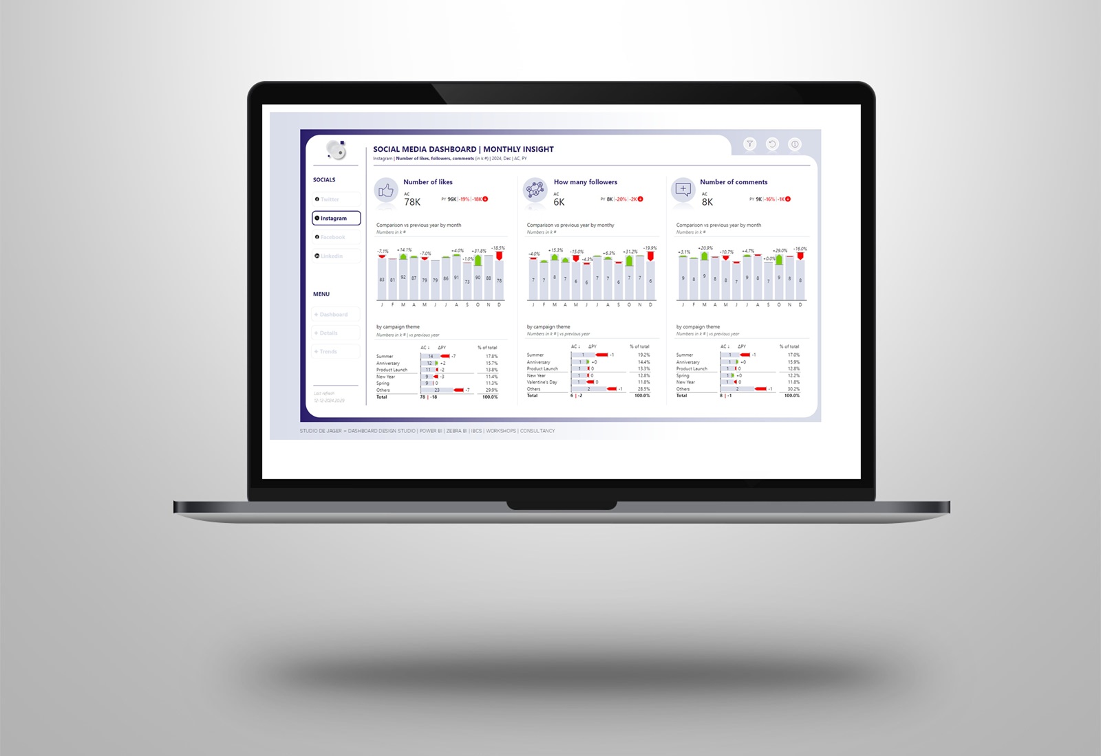
In the example I’m sharing (with demo data of Zebra BI), I’ll show how you can create a dashboard putting it all together:
✅ 𝐂𝐥𝐞𝐚𝐧 𝐝𝐞𝐬𝐢𝐠𝐧: a clean design for a nicely looking dashboard
✅ 𝐙𝐞𝐛𝐫𝐚 𝐁𝐈: Using Zebra BI visuals (cards, charts and tables) to create actionable visuals
✅ 𝐈𝐁𝐂𝐒 𝐬𝐭𝐚𝐧𝐝𝐚𝐫𝐝𝐬: a touch of IBCS for delivering consistency and clarity for quicker understanding.
✅ 𝐀𝐜𝐭𝐢𝐨𝐧𝐚𝐛𝐥𝐞 & 𝐮𝐧𝐝𝐞𝐫𝐬𝐭𝐚𝐧𝐝𝐚𝐛𝐥𝐞: A dashboard is only effective if it helps users take the right actions.
Well-designed dashboards strike the perfect balance. They’re visually appealing, intuitive, and most importantly, powerful tools for decision-making.
How do you ensure your dashboards are both stunning and effective?
studiodejager.nl | dashboard design studio
Report & dashboard design | Official Zebra BI Partner | Power BI | IBCS Certified | Data visualization | Interim business consultancy
Let’s create better reports & dashboards !