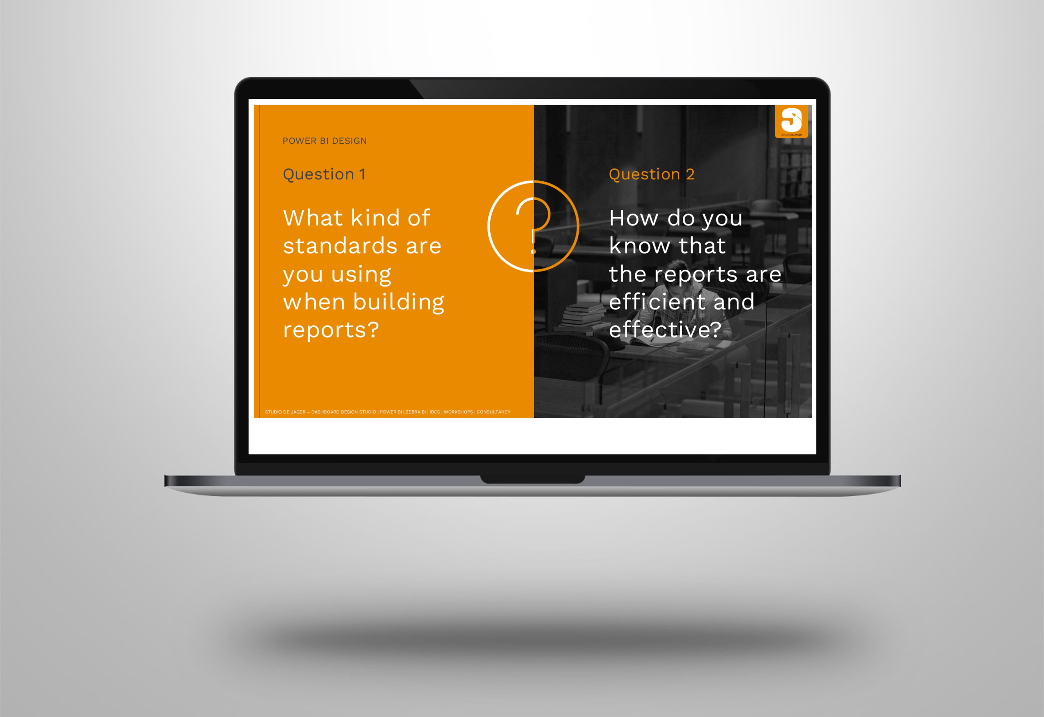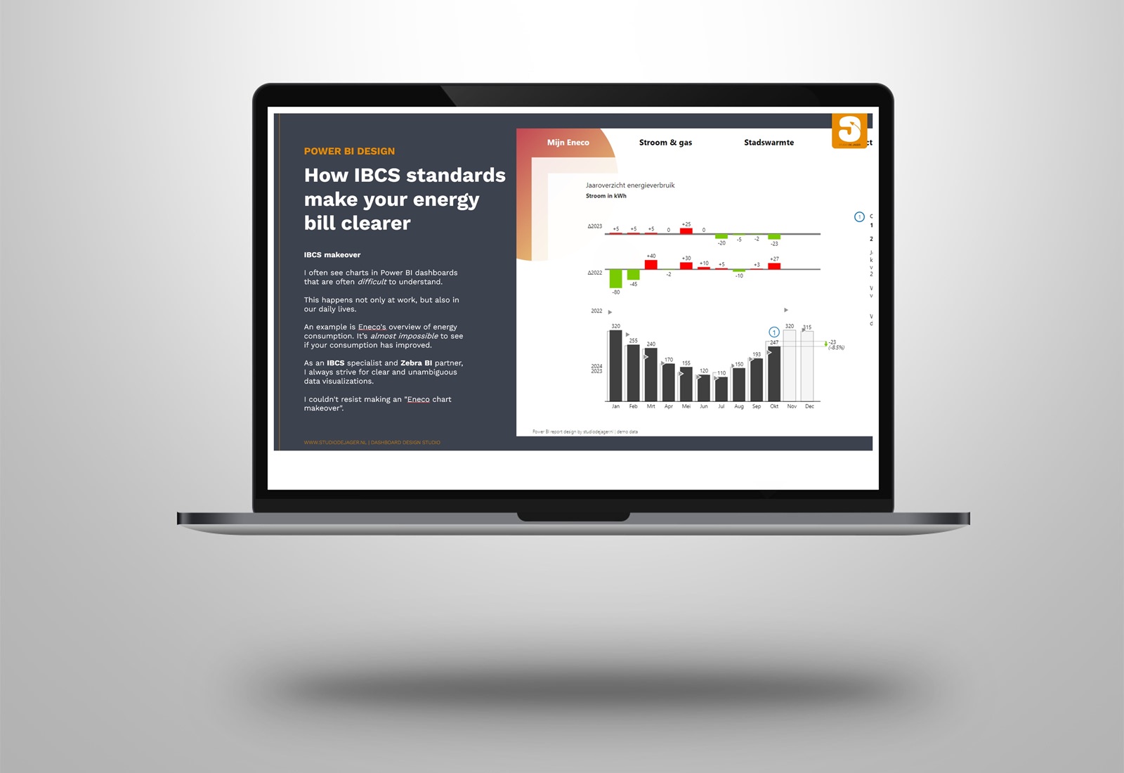
Power BI | How IBCS standards make yor energy bill clearer
I often see graphs in dashboards that are 𝐨𝐟𝐭𝐞𝐧 𝐝𝐢𝐟𝐟𝐢𝐜𝐮𝐥𝐭 𝐭𝐨 𝐮𝐧𝐝𝐞𝐫𝐬𝐭𝐚𝐧𝐝. This happens not only at work, but also in our daily lives.
Last week I received the monthly overview from Eneco with a chart showing the development of energy consumption. At first glance a lot of useful information.
𝐁𝐮𝐭 𝐜𝐚𝐧 𝐲𝐨𝐮 𝐢𝐦𝐦𝐞𝐝𝐢𝐚𝐭𝐞𝐥𝐲 𝐬𝐞𝐞 𝐢𝐟 𝐲𝐨𝐮𝐫 𝐜𝐨𝐧𝐬𝐮𝐦𝐩𝐭𝐢𝐨𝐧 𝐡𝐚𝐬 𝐢𝐦𝐩𝐫𝐨𝐯𝐞𝐝 ?
As an IBCS – International Business Communication Standards specialist and Zebra BI partner, I always strive for clear and unambiguous data visualizations and I couldn’t resist making the “Eneco chart makeover”.
𝐓𝐡𝐞 𝐄𝐧𝐞𝐜𝐨 𝐦𝐚𝐤𝐞𝐨𝐯𝐞𝐫
It is extremely difficult to see in which months your consumption is 𝐛𝐞𝐭𝐭𝐞𝐫 𝐨𝐫 𝐰𝐨𝐫𝐬𝐞 than last year.
In Eneco’s graph, a lot of information is shown at the same time. However, the graph could be improved quite a bit.
📌 This is where IBCS – International Business Communication Standards comes in by default. This standard 𝐞𝐧𝐬𝐮𝐫𝐞𝐬 𝐮𝐧𝐢𝐟𝐨𝐫𝐦𝐢𝐭𝐲 𝐚𝐧𝐝 𝐬𝐢𝐦𝐩𝐥𝐢𝐜𝐢𝐭𝐲 in data visualization, making comparisons 𝐟𝐚𝐬𝐭𝐞𝐫 𝐚𝐧𝐝 𝐦𝐨𝐫𝐞 𝐚𝐜𝐜𝐮𝐫𝐚𝐭𝐞 𝐭𝐨 𝐢𝐧𝐭𝐞𝐫𝐩𝐫𝐞𝐭.
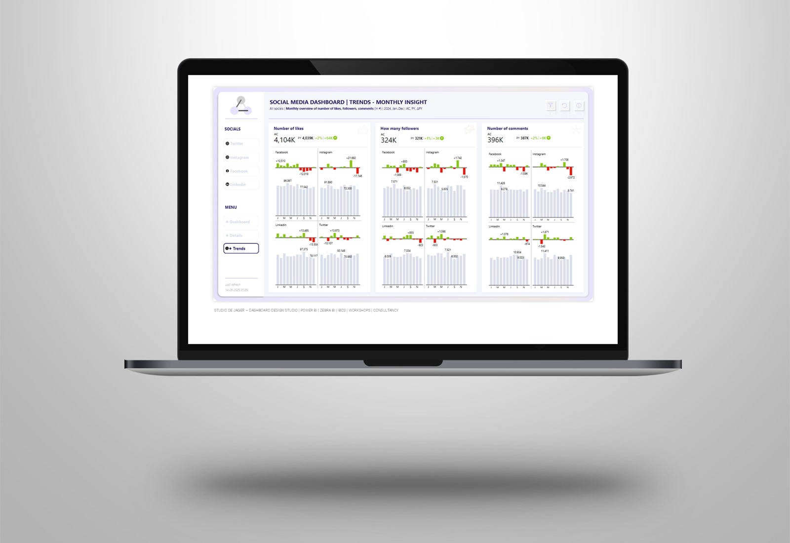
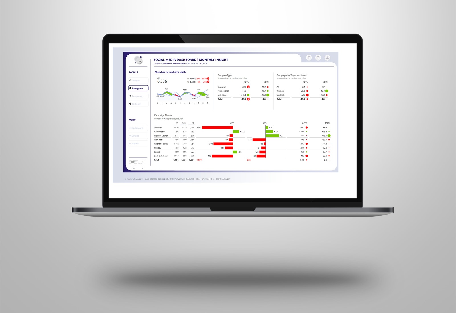
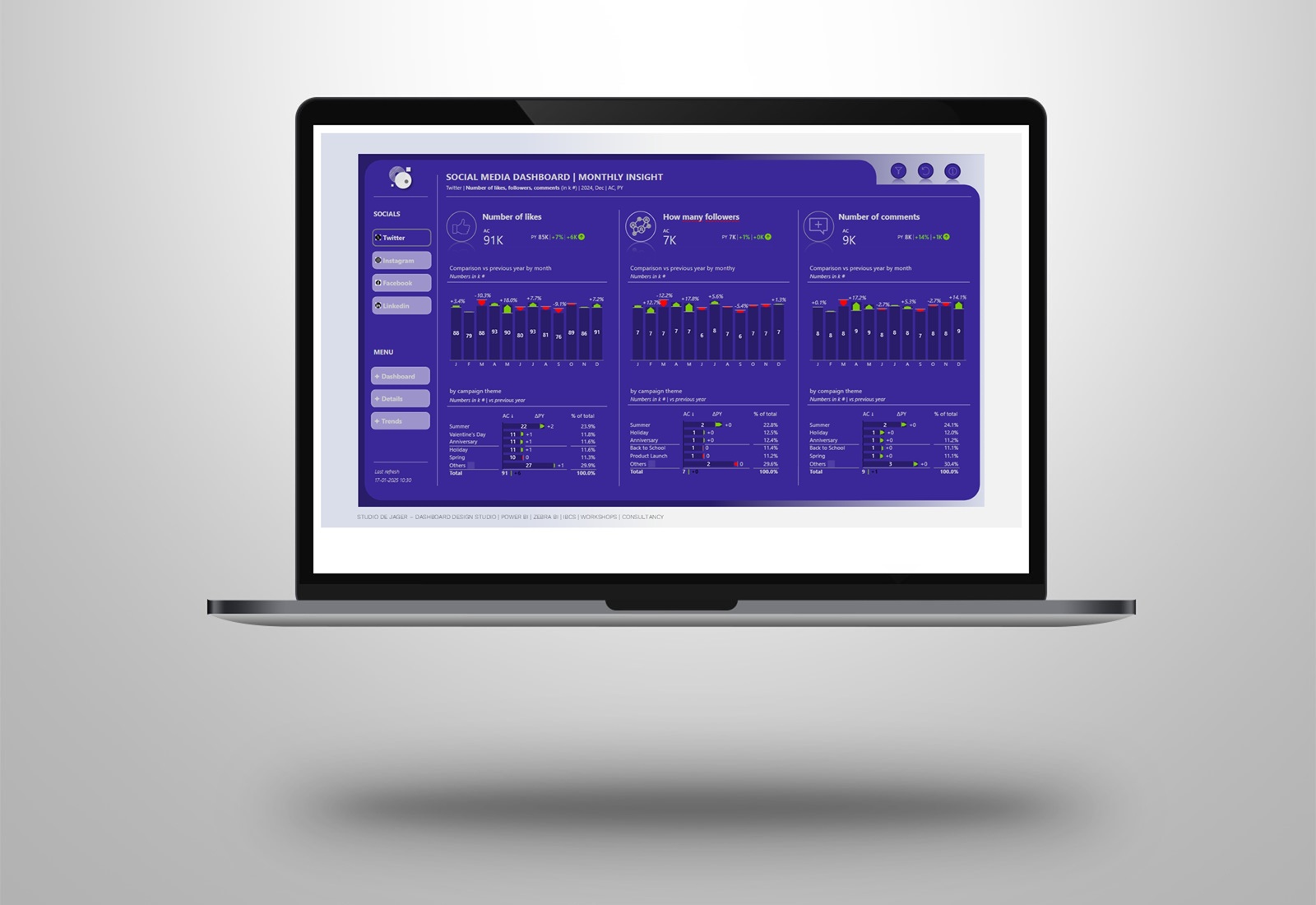
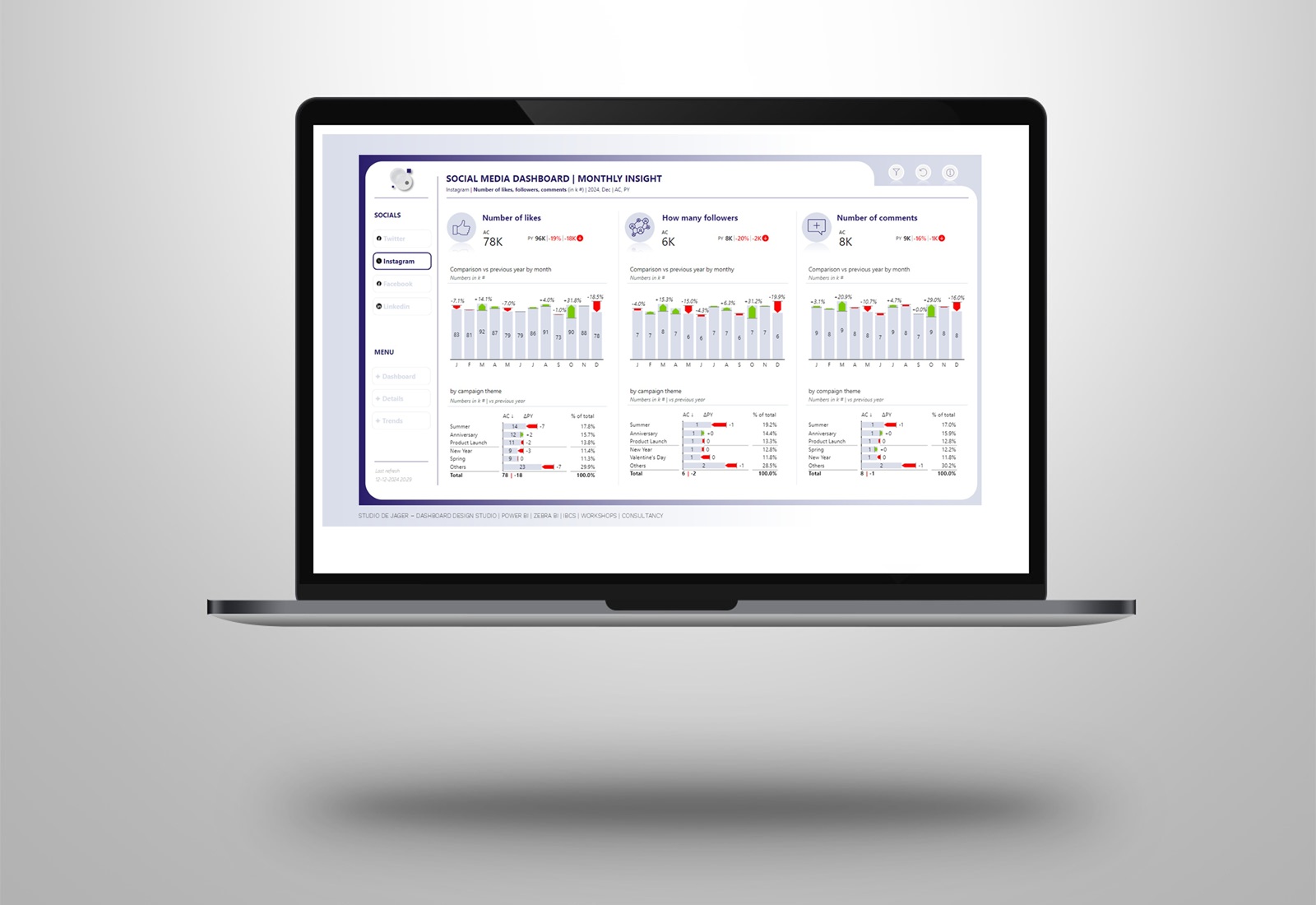
In this chart makeover, I’ve applied one of the most important core principles of IBCS – International Business Communication Standards, which is to add 𝐯𝐚𝐫𝐢𝐚𝐧𝐜𝐞𝐬. Instead of just showing the consumption of this year and last year, I focus on the differences. This makes it immediately clear how your current consumption compares to last year.
Made a simple Eneco background design, inspired by the logo (dots) and used Zebra BI chart visuals. Easy to use, no additional measures required.
📌 This approach immediately made it possible to see how my energy consumption compares to previous periods.
A 𝘴𝘪𝘮𝘱𝘭𝘦 𝘤𝘩𝘢𝘯𝘨𝘦, but a 𝐰𝐨𝐫𝐥𝐝 𝐨𝐟 𝐝𝐢𝐟𝐟𝐞𝐫𝐞𝐧𝐜𝐞.
𝐂𝐨𝐧𝐜𝐥𝐮𝐬𝐢𝐨𝐧
The IBCS – International Business Communication Standards are not only suitable for business reporting, we can also benefit from clear and structured information in our daily lives.
There is a good chance that with a few IBCS – International Business Communication Standards adjustments you will get a much clearer insight!
👉Which of the 𝐟𝐨𝐮𝐫 𝐨𝐩𝐭𝐢𝐨𝐧𝐬 I have created 𝐝𝐨 𝐲𝐨𝐮 𝐥𝐢𝐤𝐞 𝐭𝐡𝐞 𝐦𝐨𝐬𝐭? Let me know in the comments.
studiodejager.nl | dashboard design studio
Report & dashboard design | Official Zebra BI Partner | Power BI | IBCS Certified | Data visualization | Interim business consultancy
Let’s create better reports & dashboards !