Power BI | Actionable reporting - part 12 – beautiful or understandable
What should be the primary aim of a report’s visual design? It should not be beauty, but simple comprehension.
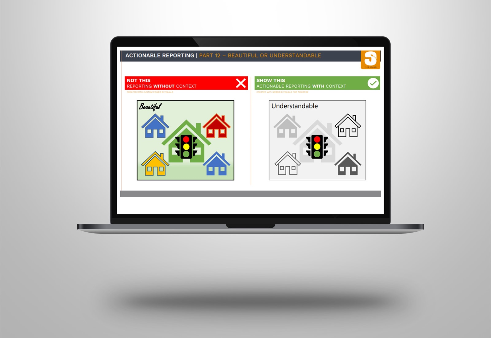
Many will find the richly colored picture on the left of the attached example more beautiful than the one on the right.
But what if our message concerns the traffic light?
It is much easier to see it in the picture on the right. In the end, that’s what really matter !
In today’s reality, creating reports that are just showing some numbers is not enough. Actionable Reporting is about getting insights fast: the faster you learn what’s happening with your performance, the faster you can decide what to do next.
When looking at a report visual, you should be able to tell right away if your performance.
Color is a crucial element in data visualization and communication. Too much color in your visuals can distract from what’s really important. Off course corporate design can also be important in your Power BI reports, but be careful using it in visuals.
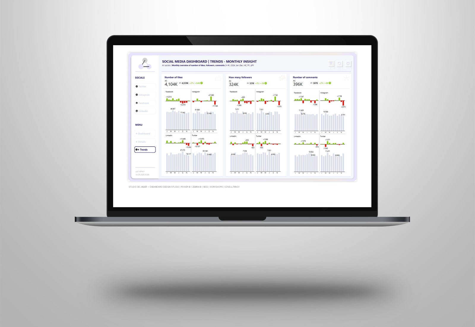
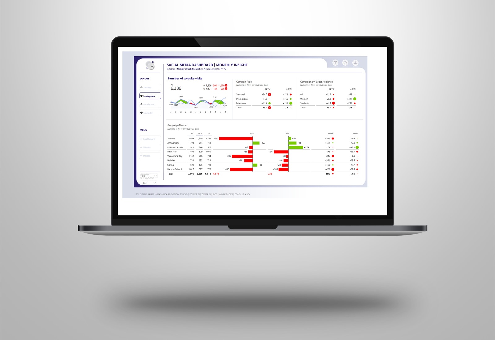
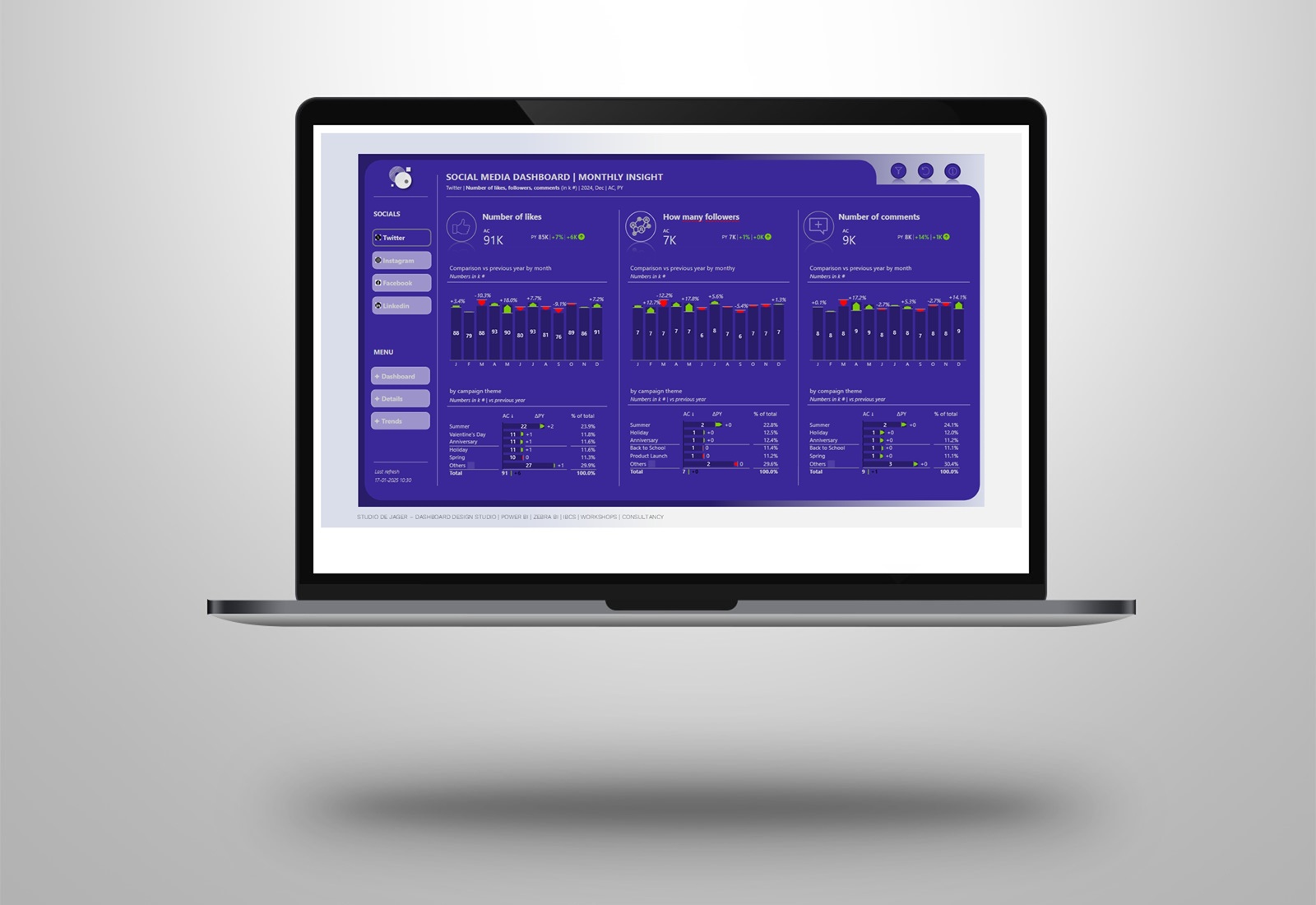
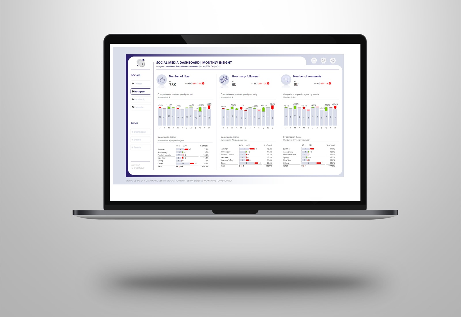
In my reports I often use the IBCS standards in the Zebra BI visuals, mixed with a corporate design on the outsides of the report canvas. See some of the reports in the attached example.
Need help with transforming your data into actionable reports? As an official Zebra BI partner we can help you with this.
studiodejager.nl | report & dashboard design studio
Report & dashboard design | Official Zebra BI Partner | Power BI – Excel | IBCS Certified Analyst | Data visualization | Interim business consultancy
Let’s create better reports & dashboards !
