The growth of internet advertisement spending
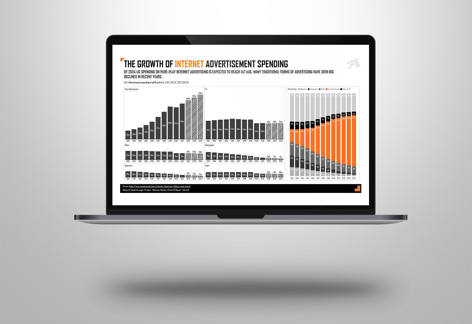
This week’s visualization is about the type of advertisement spending in the US as part of MakeoverMonday week 46. The original viz is from visualcapitalist.
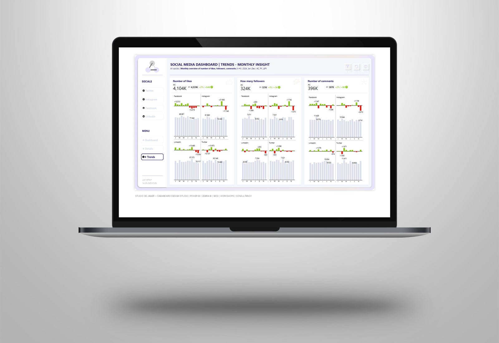
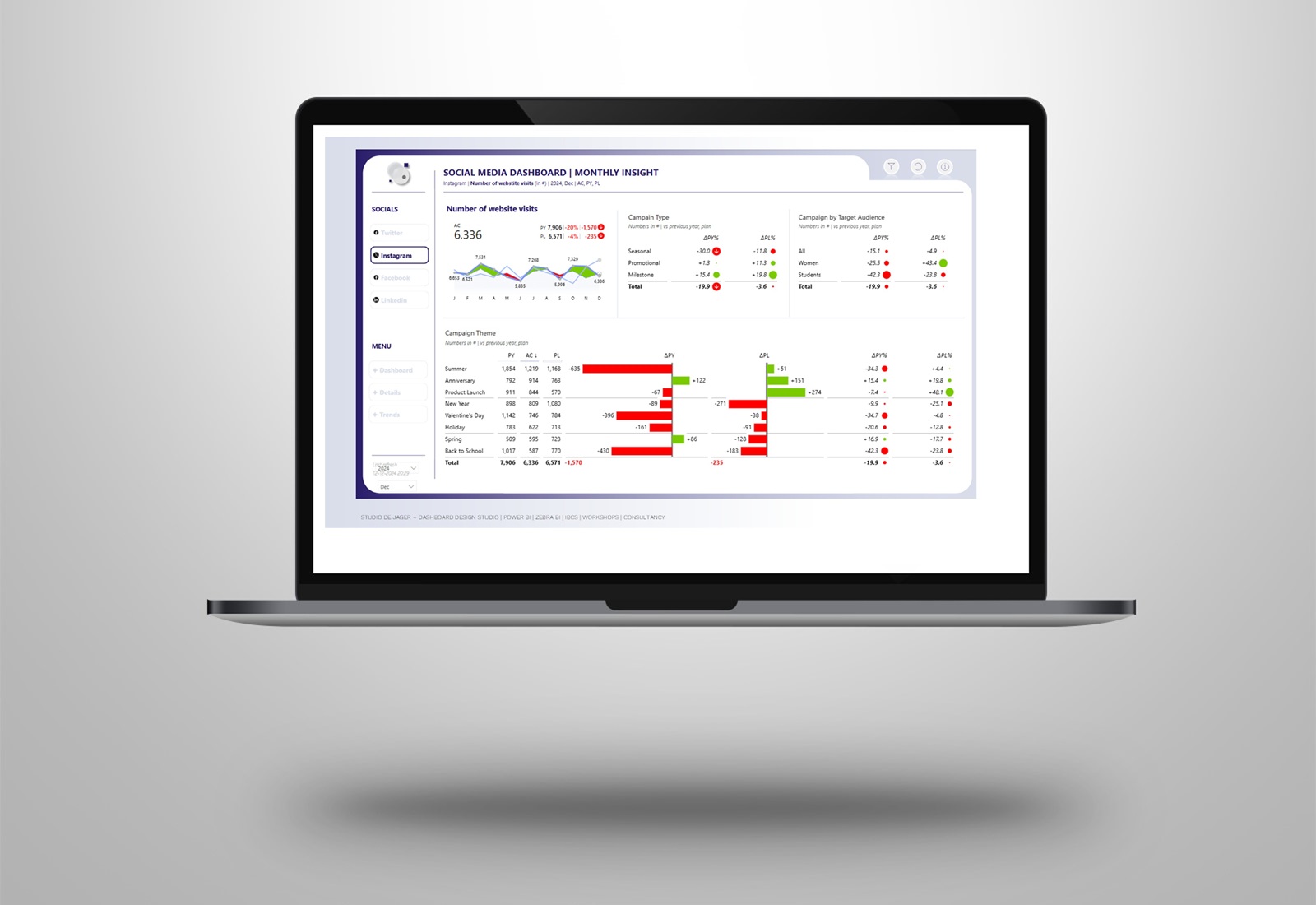
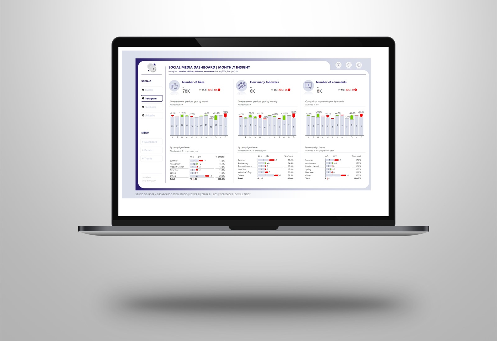
Created the visual in Power BI with the use of the Zebra BI visuals. My favorite is the use of the small multiples, very useful for this kind of insights.
Introduced by J. Bertin and popularized by E. Tufte, the small multiples are considered one of the most powerful data visualization methods.
Very easy to create in Power BI with Zebra BI.
- Small multiple charts, easy to create insightful comparisons in just a few clicks
- All the charts will be automatically rendered according to the same scale (automatically synchronized Y-axis)
- Enables end users to compare multiple data categories on the same page
- Use of colors for the charts (solid for actuals and hatched for forecasting)
- IBCS® certified
- Interactive with other (custom) visuals in Power BI, such as the stacked bar chart.
