Visualizing the tiny profit margin of Amazon.com
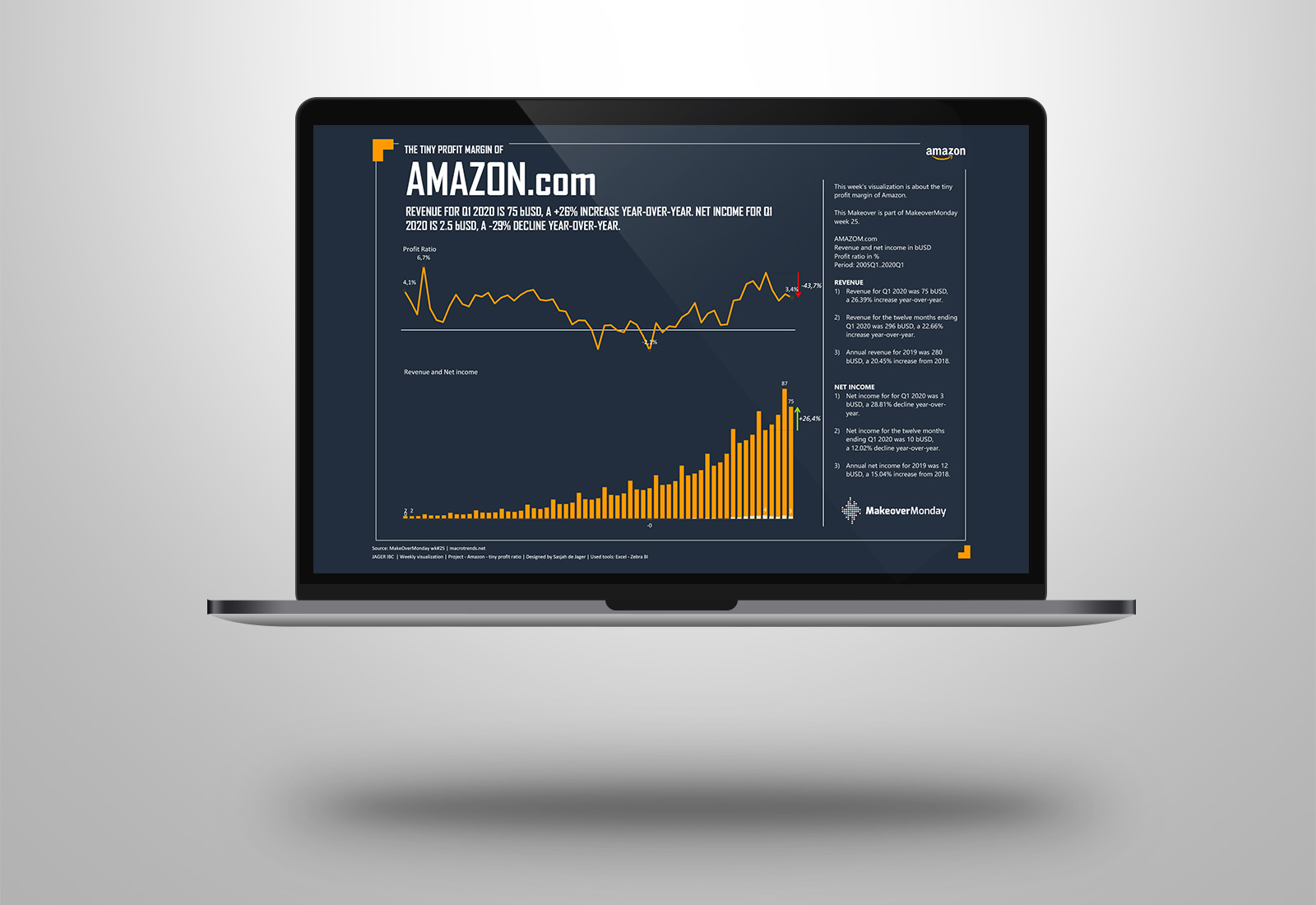
This week’s visualization is about the tiny profit margin of Amazon.com as part of MakeoverMonday week 25.
This week I used the charts of Zebra BI to show the development of the revenue and the profit margin.
As a difference to the original Viz I created a separate line chart with the profit ratio. In both charts the difference of the year-over-year comparison is highlighted.
Created a color palette with coloors.co of Amazon’s corporate colors and used it in Zebra BI. In Zebra BI you can easily change the default custom colors setting and use your own corporate colors.
See the difference with the original.
