Visualizing -with- Nintendo
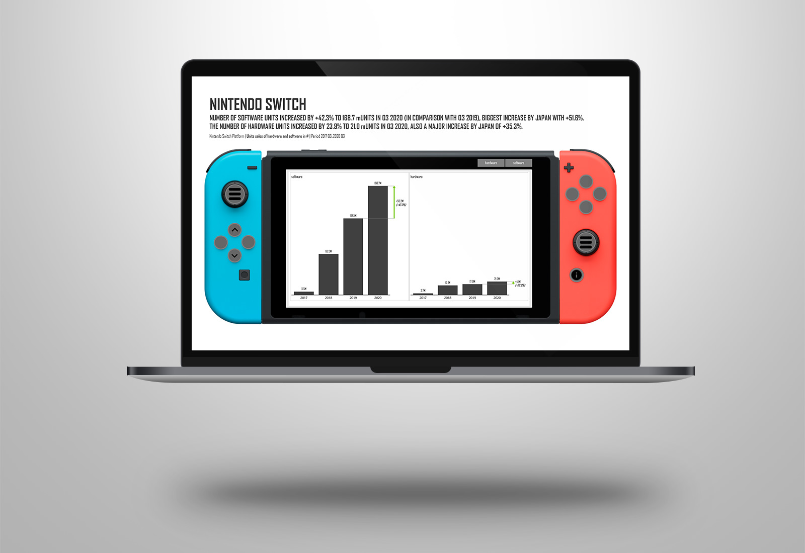
This week’s visualization is about the number of sold Nintendo units (hardware and software) as part of MakeoverMonday week 45. The original viz is from Nintendo itself.
Take a look at the original viz from Nintendo. It’s not easy to read if you use two Y-axes with different scaling for the same notation. And to use stacked bar charts and line charts together. It’s also hard to understand the number notation, it’s by 10 thousand numbers. It should be easier to show the numbers by millions.
I got the inspiration for this visual from Armand van Amersfoort, he creates amazing UX visuals in Power BI.
For the makeover I decided to use a different layout in Power BI, not the standard Mobile layout but to create a “Nintendo Switch layout”. Using a lot of bookmarks, icons, shapes and images I managed to make it interactive. So you can play with the Nintendo and look at the numbers, just push the buttons.
But of course with the usage of the Zebra BI visuals to get the right scaling, use the right colors , show the variances and to use the small multiple charts.
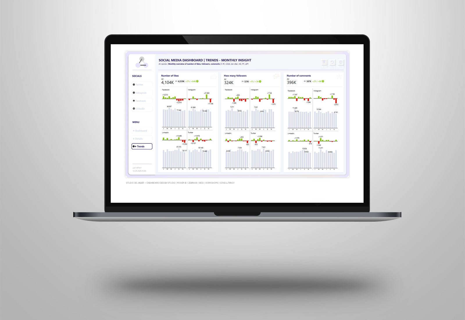
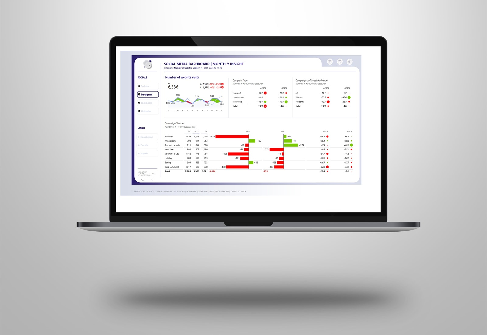
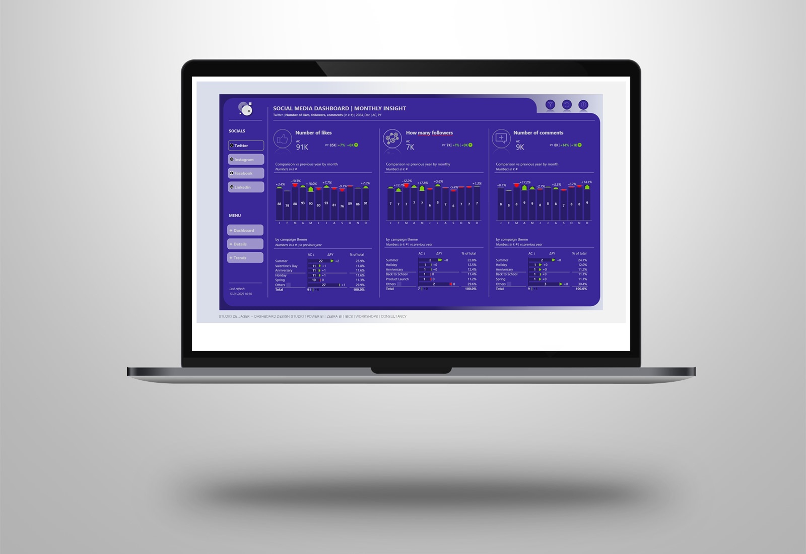
A few screenshots of the Power BI report are attached in the PDF.
