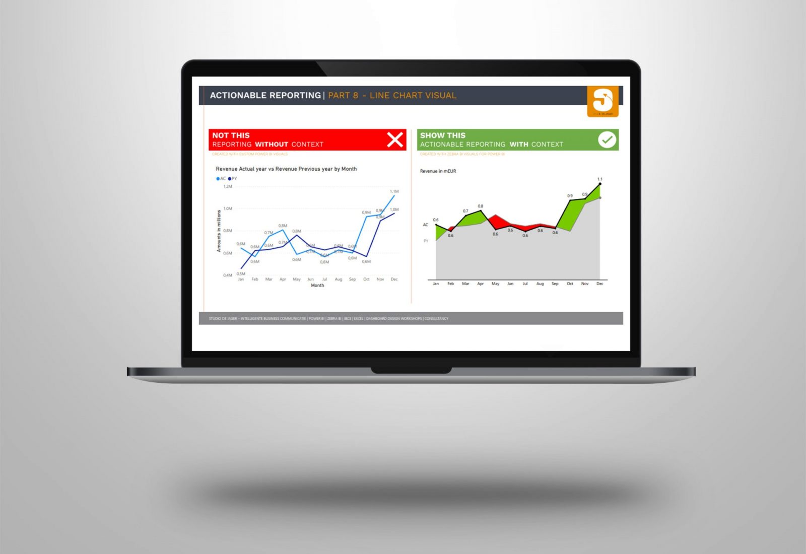
Power BI | Actionable reporting – part 8 – line chart visual
Do you use line chart visuals in your report? How effective are they on a dashboard? Are they easy to read and to understand for the viewer? In today's reality, creating reports that >> Lees verder
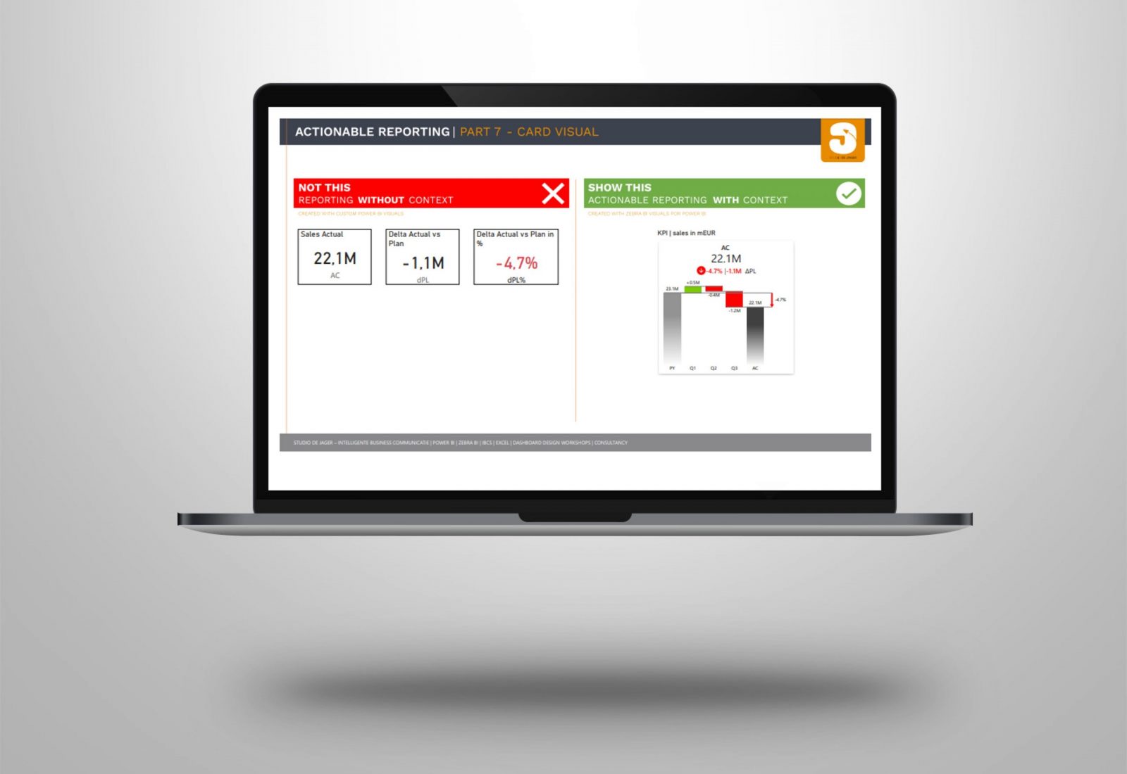
Power BI | Actionable reporting – part 7 – KPI card visual
Do you use KPI card visuals in your report? Cards visuals should probably be the best way to show an overview of the most important KPIs. How effective are they on a dashboard? >> Lees verder
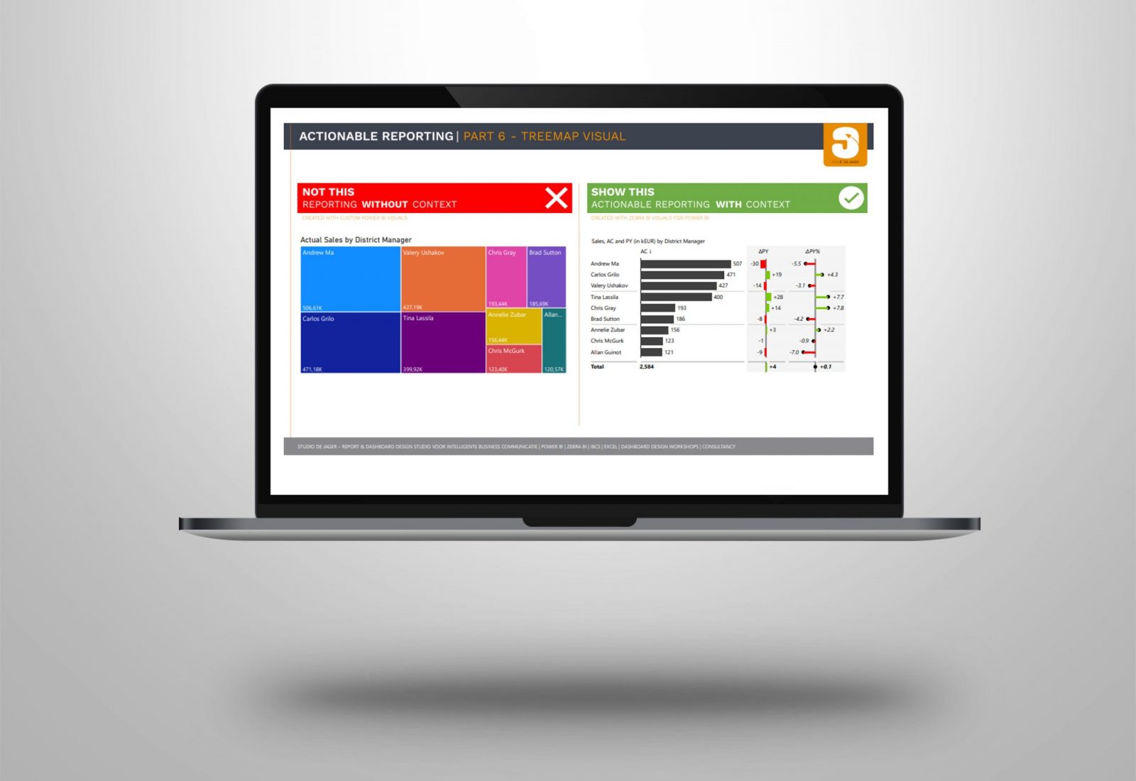
Power BI | Actionable reporting – part 6 – treemap visuals
Do you use treemap visuals in your report? How effective are they on a dashboard? Are they easy to read and to understand for the viewer? In today's reality, creating reports that are >> Lees verder
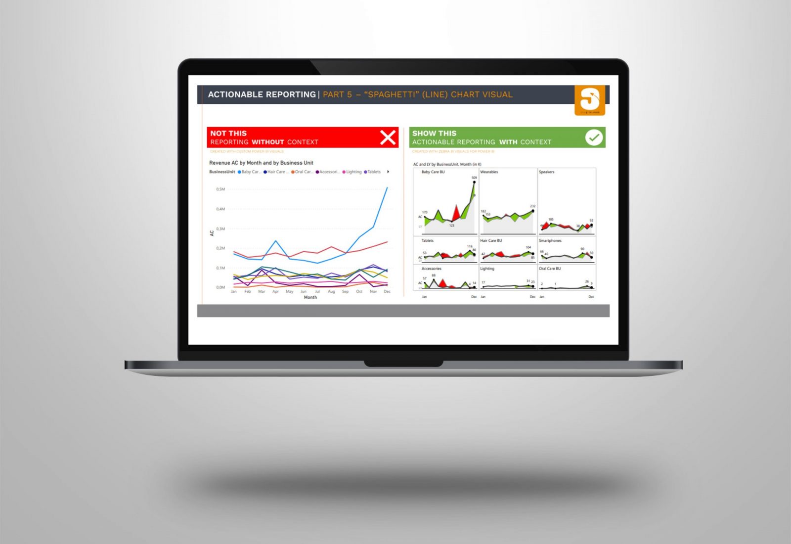
Power BI | Actionable reporting – part 5 – “spaghetti” (line) chart visuals
Do you use “spaghetti” charts in your report? How effective are they on a dashboard? Are they easy to read and to understand for the viewer? In today's reality, creating reports that are >> Lees verder
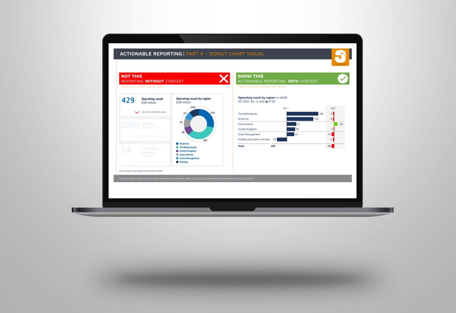
Power BI | Actionable reporting – part 4 – donut visual by Aegon
Do you use donut visuals in your report? How effective are they on a dashboard? Are they easy to read and to understand for the viewer? In today's reality, creating reports that are >> Lees verder

Power BI | Actionable reporting – part 3 – gauge visual
Do you use gauge visuals in your report? How effective are they on a dashboard? Are they easy to read and to understand for the viewer? In today's reality, creating reports that are >> Lees verder

Power BI | Actionable reporting – part 2 – chart visual
In today's reality, creating reports that are just showing some numbers is not enough. Actionable Reporting is about getting insights fast: the faster you learn what’s happening with your performance, the faster you >> Lees verder

Power BI | Actionable reporting – part 1 – matrix visual
In today's reality, creating reports that are just showing some numbers is not enough. Actionable Reporting is about getting insights fast: the faster you learn what’s happening with your performance, the faster you >> Lees verder

Power BI | Financial dashboard with a Grant Thornton design
Did you ever think of using IBCS standards to your Power BI dashboard? But …….. you think the IBCS colors (grey) are boring ……? Why not use your corporate identity and replace the >> Lees verder
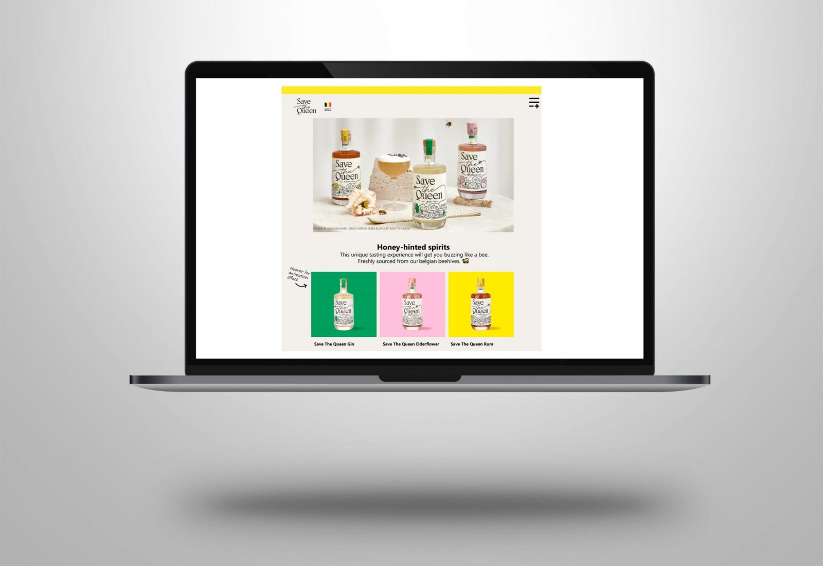
Power BI | Save The Queen design of a start page with animation effects
What is the first page to look at when you open a website? What is the first page when you open a Power Point presentation? It is a landing page or start page, >> Lees verder