Power BI | Financial dashboard with a Grant Thornton design
Did you ever think of using IBCS standards to your Power BI dashboard? But …….. you think the IBCS colors (grey) are boring ……?
Why not use your corporate identity and replace the colors by your own company colors?
How does that look?
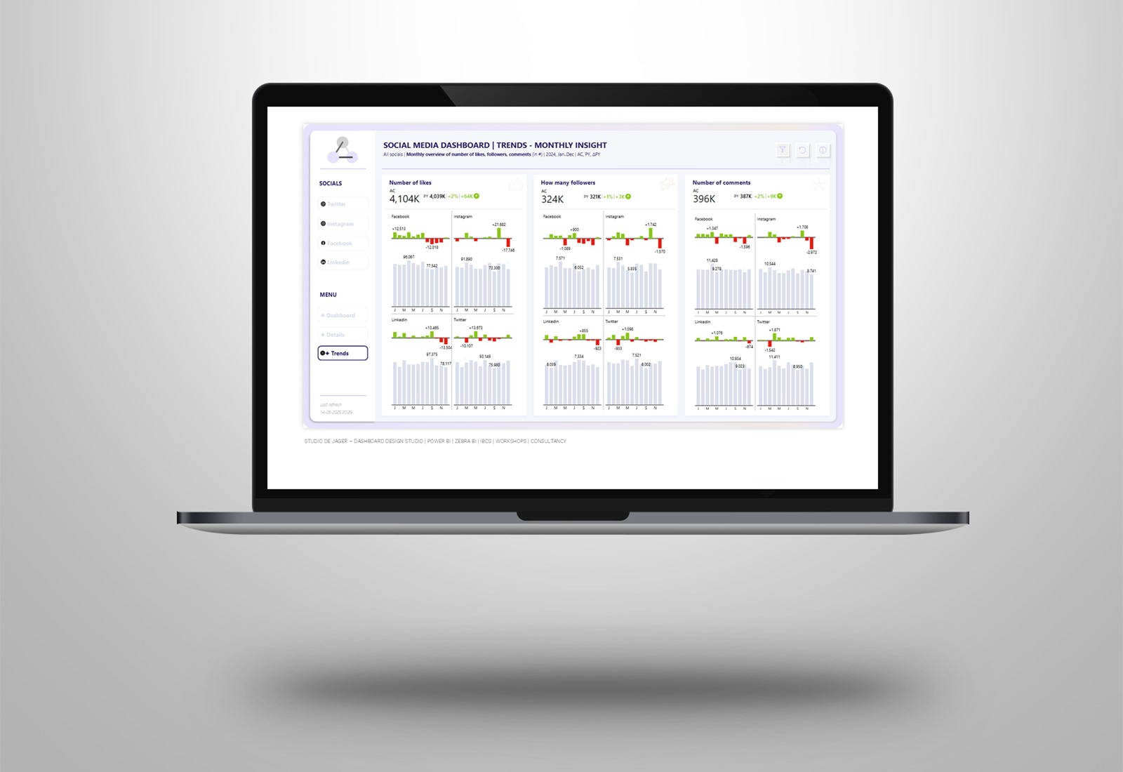
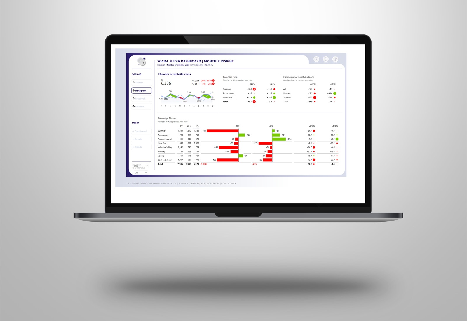
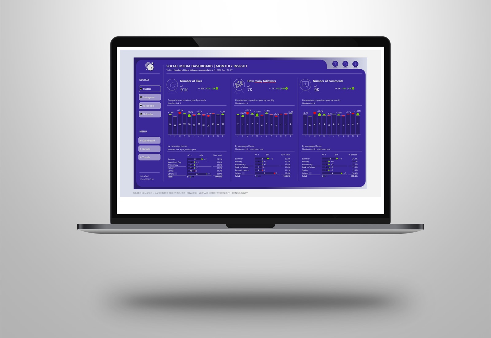
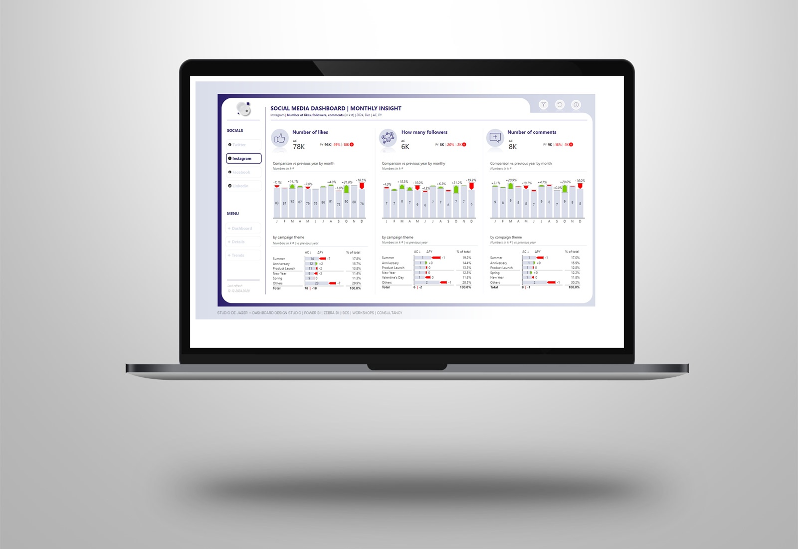
For a Zebra BI demo I have created a Grant Thornton designed financial report. In the dashboard I used fake data & text, used the Zebra BI visuals and gave it all a Grant Thornton design.
You can see in the example that you can use your company colors in the IBCS Zebra BI visuals, but I recommend to do this consistently and always use the same color scheme for the different scenario’s (actuals, last year, budget and forecast).
Financial report
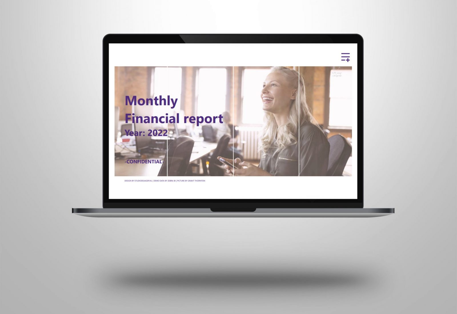
Started with a nice landing page with a dynamic background for which I added some coding to the used .svg file. Inspired from Jefferson Alves is use this background effects a lot in my reports.
The reports allows you to have a clear overview of the P&L statement, balance sheet, cashflow in a few different ways.
About Grant Thornton
Grant Thornton Netherlands is a member of Grant Thornton International Ltd (GTIL), one of the world’s largest networks (#7) of independent accounting and advisory firms with 62,000 professionals in more than 135 countries.
Attached screenshots of the dashboard.
Hope you like it !
Do you also want to have a nicely designed Power BI dashboard with your own company colors?
Let’s get in touch !
Sasjah de Jager
Report & dashboard design | Official Zebra BI Partner | Power BI – Excel |
IBCS Certified Analyst | Data visualization | Interim business consultancy
Let’s create better reports & dashboards !
#zebrabi #visualization #powerbi #report #dashboard #UX #UI design #ibcs #design
