Power BI | Actionable reporting - part 1 - matrix visual
In today’s reality, creating reports that are just showing some numbers is not enough. Actionable Reporting is about getting insights fast: the faster you learn what’s happening with your performance, the faster you can decide what to do next.
When looking at a report visual, you should be able to tell right away if your performance:
1️⃣ is good or bad,
2️⃣ how good or how bad,
How much time does it cost you to answer any of those questions by looking at a traditional report visual?
A frequently used visual in Power BI is the matrix visual, which I regularly see in Power BI reports.
If you want to build a matrix visual, how much time do you spend on creating this visual?
……. you have to make additional measures (delta last year, delta last year in % …..) and then the whole formatting hassle to, for example, adjust the cell layout with conditional formatting ……
Ok, finally you’re done. And now, look what you’ve made. Is this actionable & understandable for the reader…….?
There is a better way to make reports interesting, meaningful, understandable and actionable.
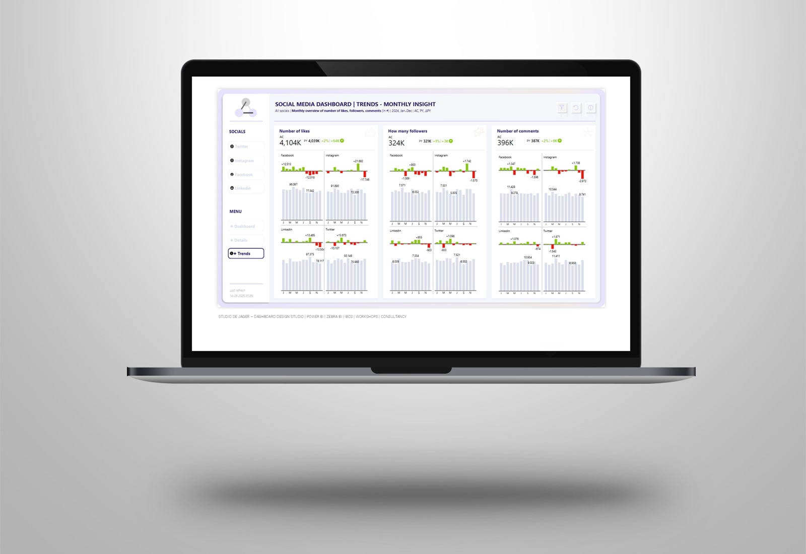
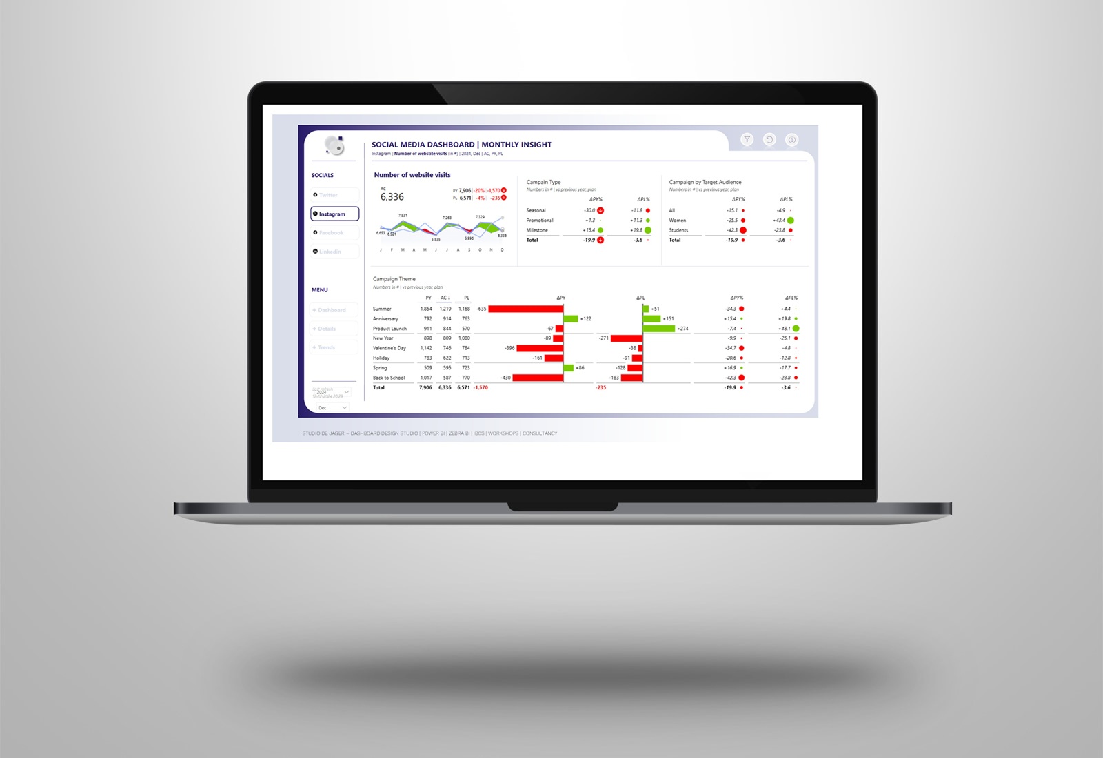
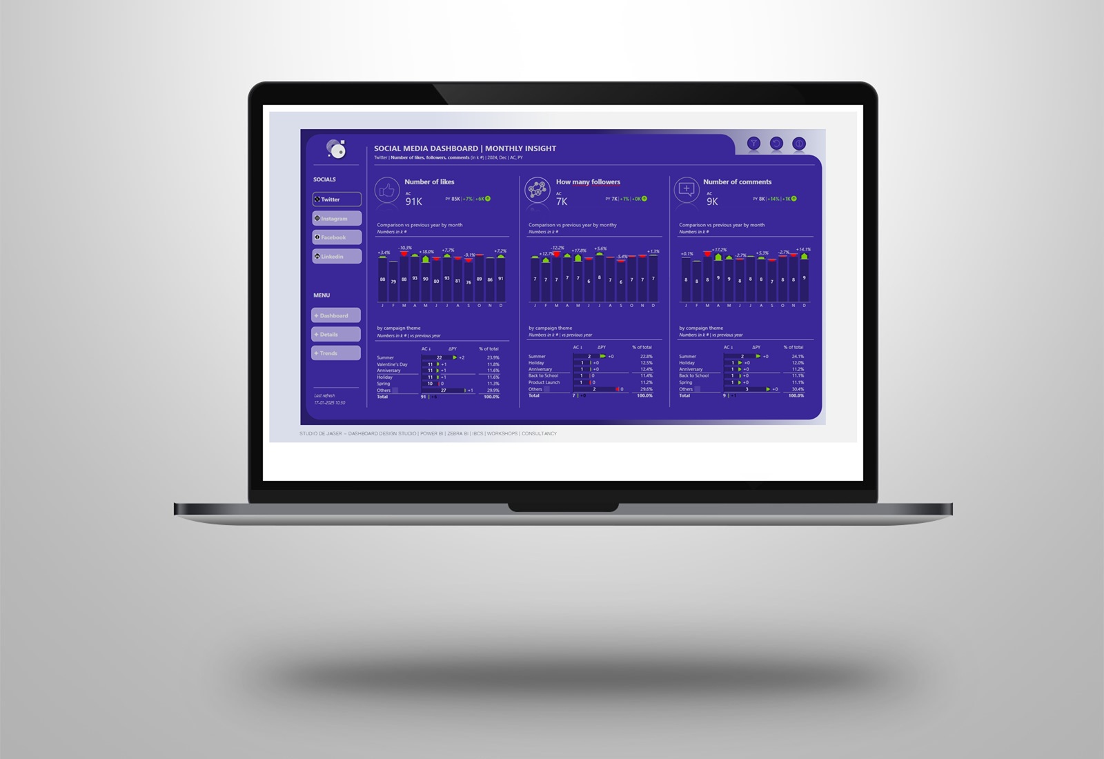
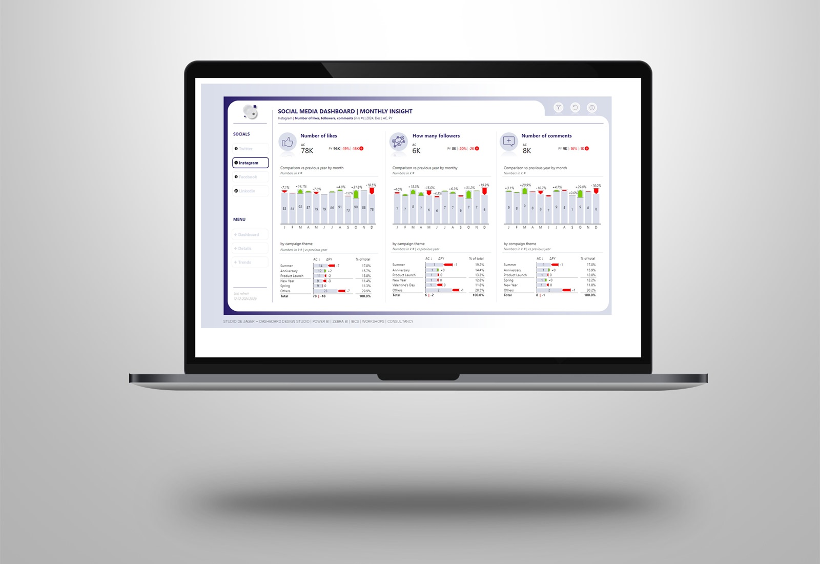
Here is an example of a matrix visual how this might look like in your report, a before vs after with the use of Zebra BI visuals and IBCS standards.
Why is the matrix visual not actionable?
- The column width should not be defined by the label length and goal variance column is simply too wide for its content.
- In column headings, the term “Sales” is repeated three times, which is redundant.
- Labels should be right-aligned while letters K denoting thousands should be in the chart title or subtitle.
Why using Zebra BI?
- Easy to use without having to create extra measures
- Build reports 10x faster, get immediate visualization of your data
- Automatic applying of IBCS standards
- Increase in speed of analysis by +46%
- Improvement in decision accuracy by +61%
Need help with transforming your data into actionable reports? As an official Zebra BI partner we can help you with this.
Studio de Jager
Report & dashboard design studio
Official Zebra BI Partner | Power BI – Excel | IBCS Certified Analyst | Data visualization | Interim business consultancy | dashboard design
Let’s create better reports & dashboards !
#zebrabi #visualization #report #dashboard #UX UI design #design #PowerBI #PowerBICommunity #Data #BusinessIntelligence #BI #IBCS
rd #UX #UI design #ibcs #design

