Power BI | Sonos product animation
How do you play your music, at home, at work or on the go?
Since the early beginning I’m a big fan of the Sonos products for listening to music. Music gives a lot of happiness.
With Sonos, you can connect the speakers to each other via your home network. This way you listen to the same song throughout the house or different music in every room. So, no reason to argue with your kids ………
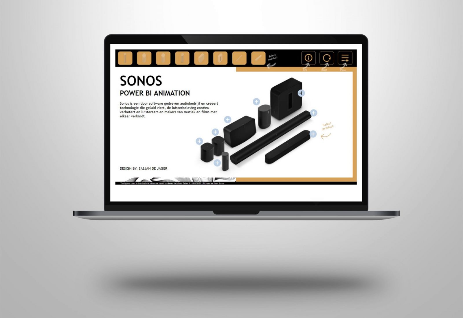
I thought it would be nice to make a Microsoft Power BI animation dashboard with the Sonos products.
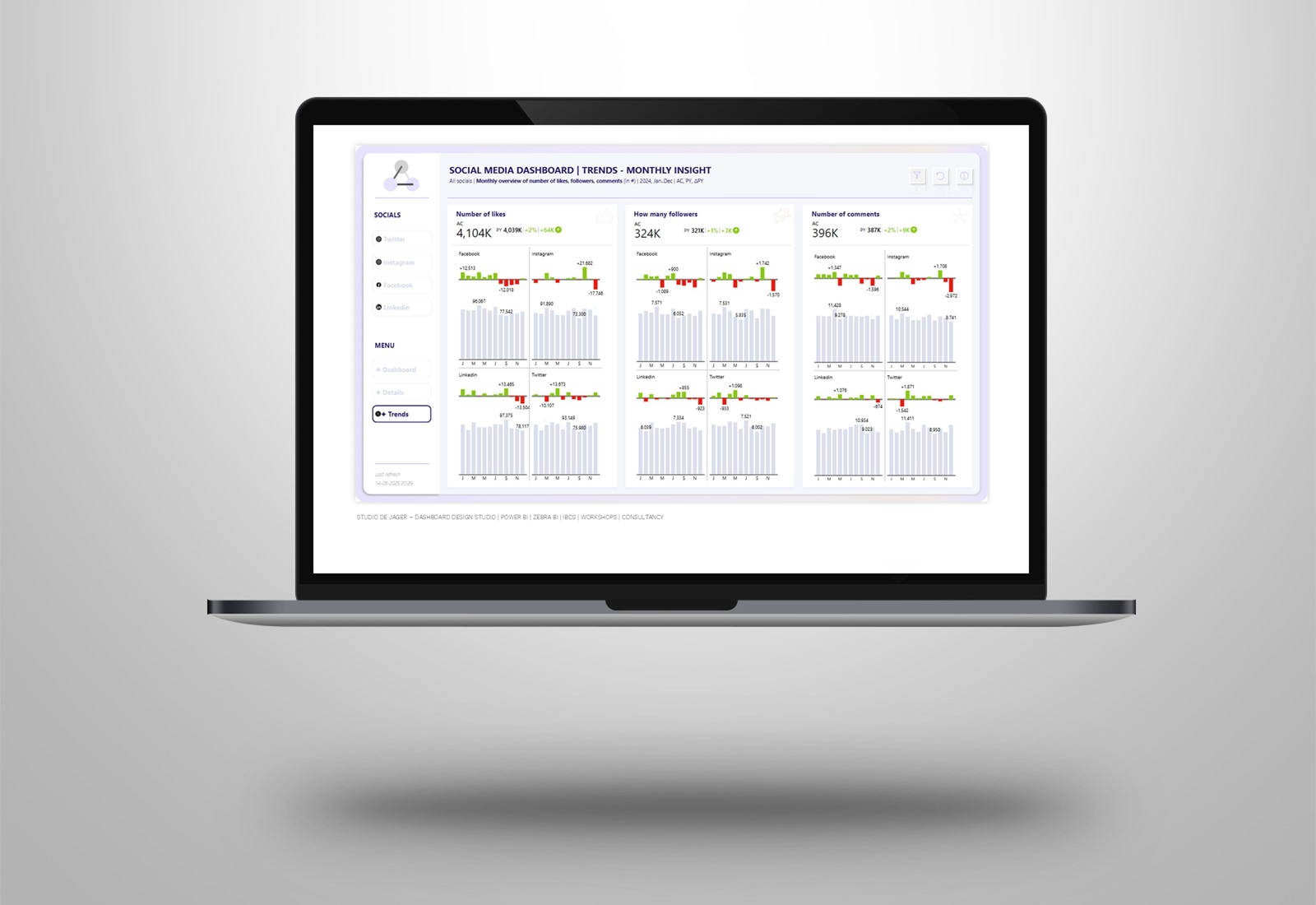
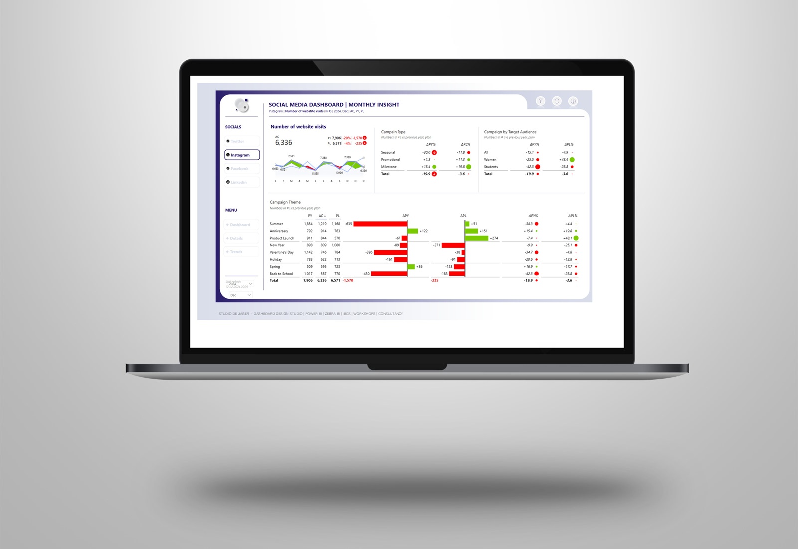
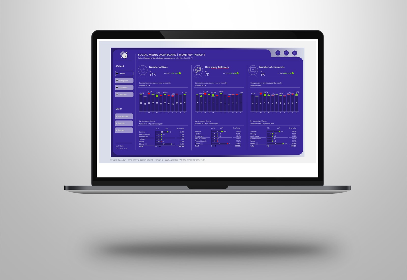
Designed all the individual elements such as animations, backgrounds, colors, buttons, text and brought this together with a lot of bookmarks and buttons in Power BI. In the dashboard I used fake data, used a different Zebra BI chart type by every product and gave it all a Sonos design.
All the navigation in the dashboard is done by bookmark navigation instead of using the normal page navigation. This is because you want to start (or land) on the default settings of each page. This can be done by using bookmark navigation.
Link to the video to check out the cool animations: https://www.loom.com/share/2d72281f47f34d068220e67da93b35c1?sharedAppSource=personal_library
Thank you Sonos (https://www.sonos.com/) for bringing the music into our lives.
Sasjah de Jager
Report & dashboard design | Zebra BI Partner | Power BI – Excel |
IBCS Certified Analyst | Data visualization | Interim business consultancy
Let’s create better reports & dashboards !
#zebrabi #visualization #powerbi #zebraBI #report #dashboard #UX #UIdesign #Sonos
