Power BI | Working capital dashboard with a Coolblue design
Did you ever think of using IBCS standards to your Power BI dashboard? But …….. you think the IBCS colors (grey) are boring ……?
Why not use your corporate identity and replace the colors by your own company colors?
How does that look?
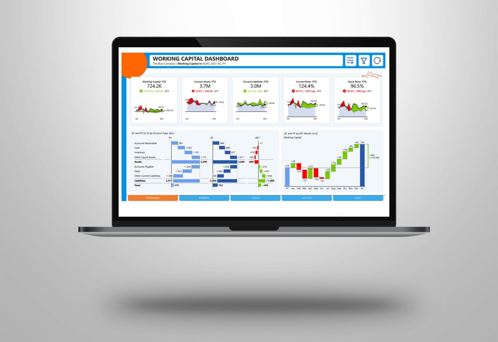
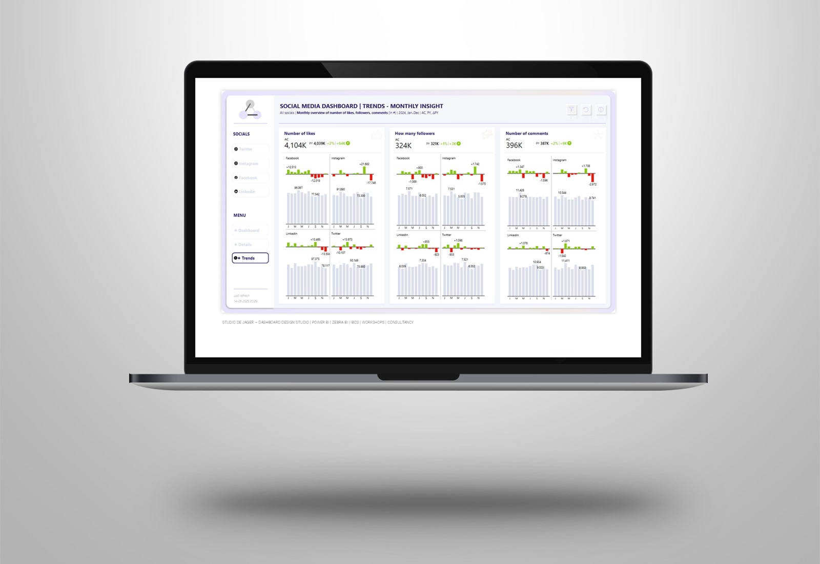
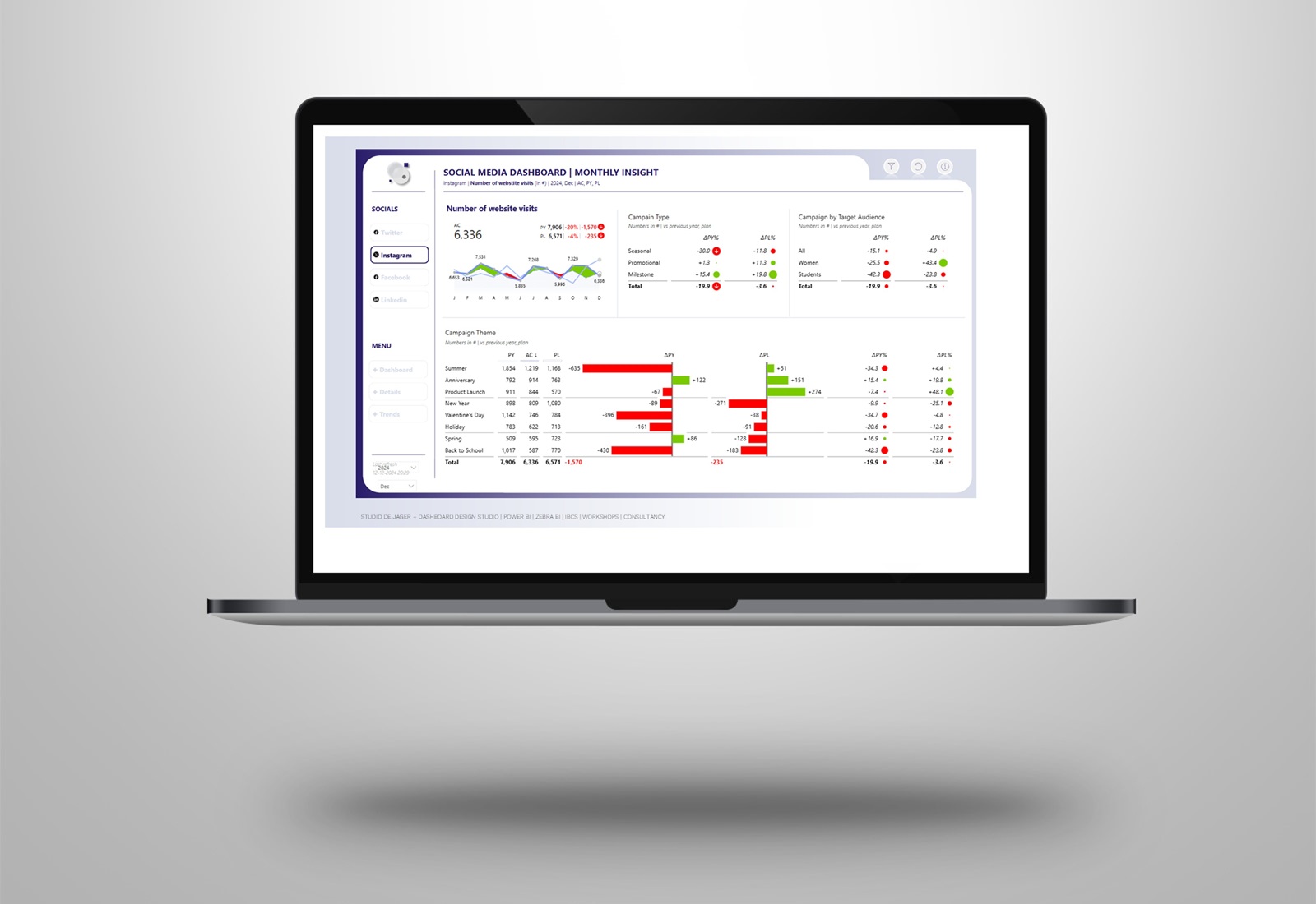
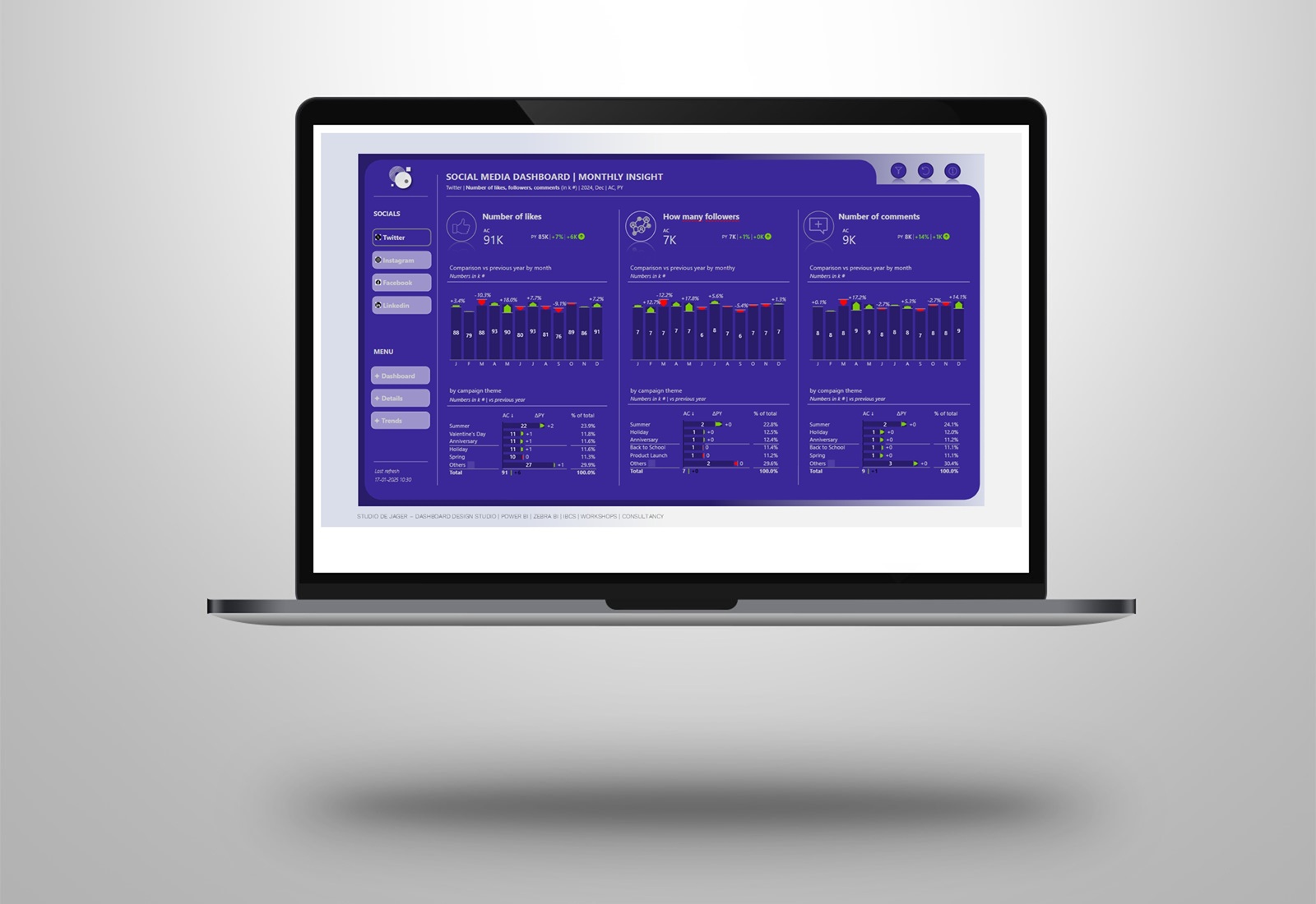
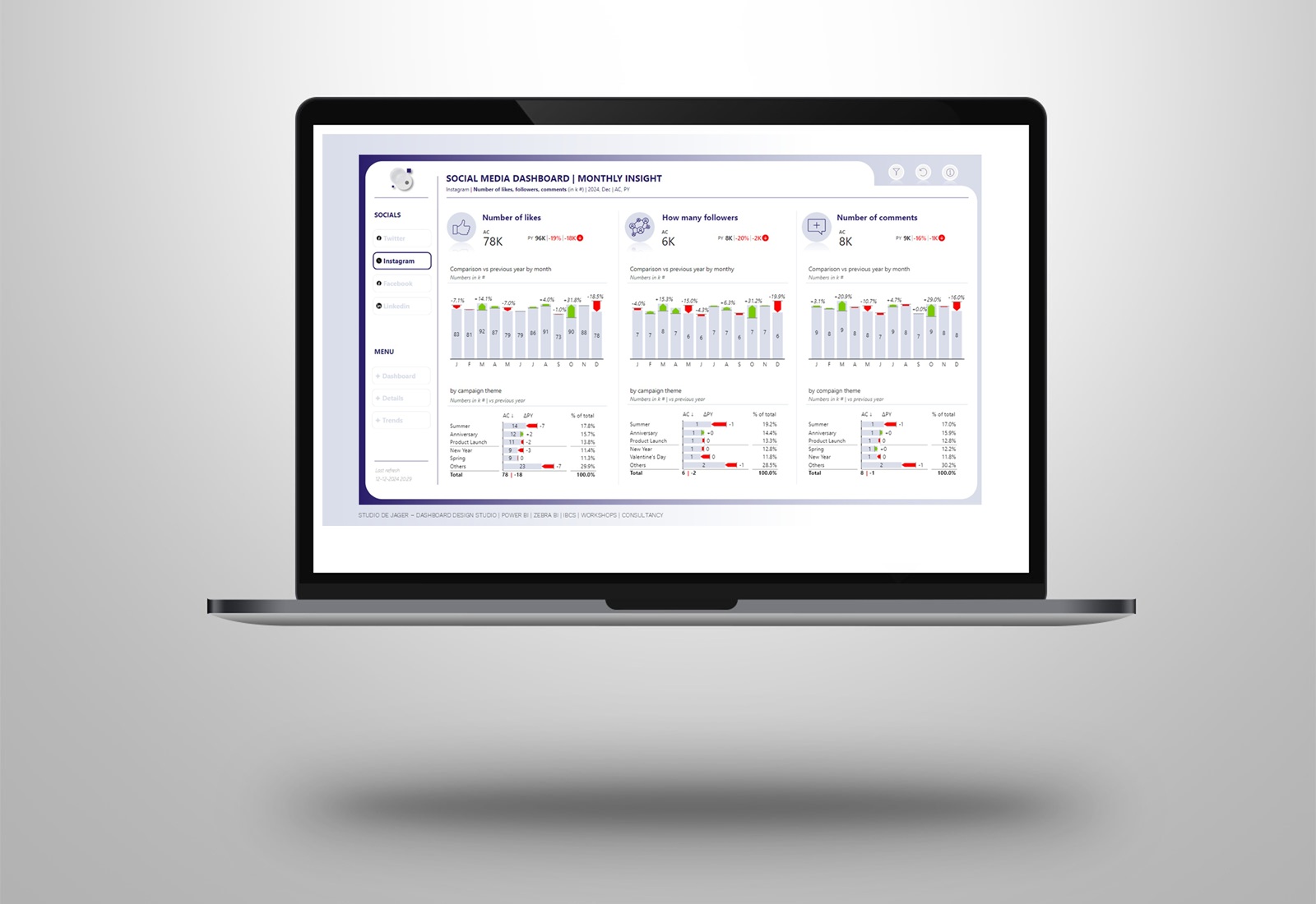
I have created a Coolblue designed working capital report. In the dashboard I used fake data & text, used the Zebra BI visuals and gave it all a Coolblue design.
You can use your company colors in the IBCS Zebra BI visuals but I recommend to do this consistently and always use the same colors for the actuals.
Working capital report
The reports allows you to have a clear overview of the Current Assets, Current Liabilities and the difference between them – Working Capital. You can understand the balance sheet at a glance and analyze the trends of each KPI.
About Coolblue
Dutch e-commerce company founded in 1999. The company is active with both a webshop and physical stores in the Netherlands, Belgium and Germany. In 2021, Coolblue reported a turnover of 2.3 billion euros, with a profit (EBITDA) of 91 million euros.
Attached screenshots of the dashboard.
Hope you like it !
Do you also want to have a nicely designed Power BI dashboard with your own company colors?
Let’s get in touch !
Sasjah de Jager
Report & dashboard design | Official Zebra BI Partner | Power BI – Excel |
IBCS Certified Analyst | Data visualization | Interim business consultancy
Let’s create better reports & dashboards !
#zebrabi #visualization #powerbi #report #dashboard #UX #UI design #ibcs #design
